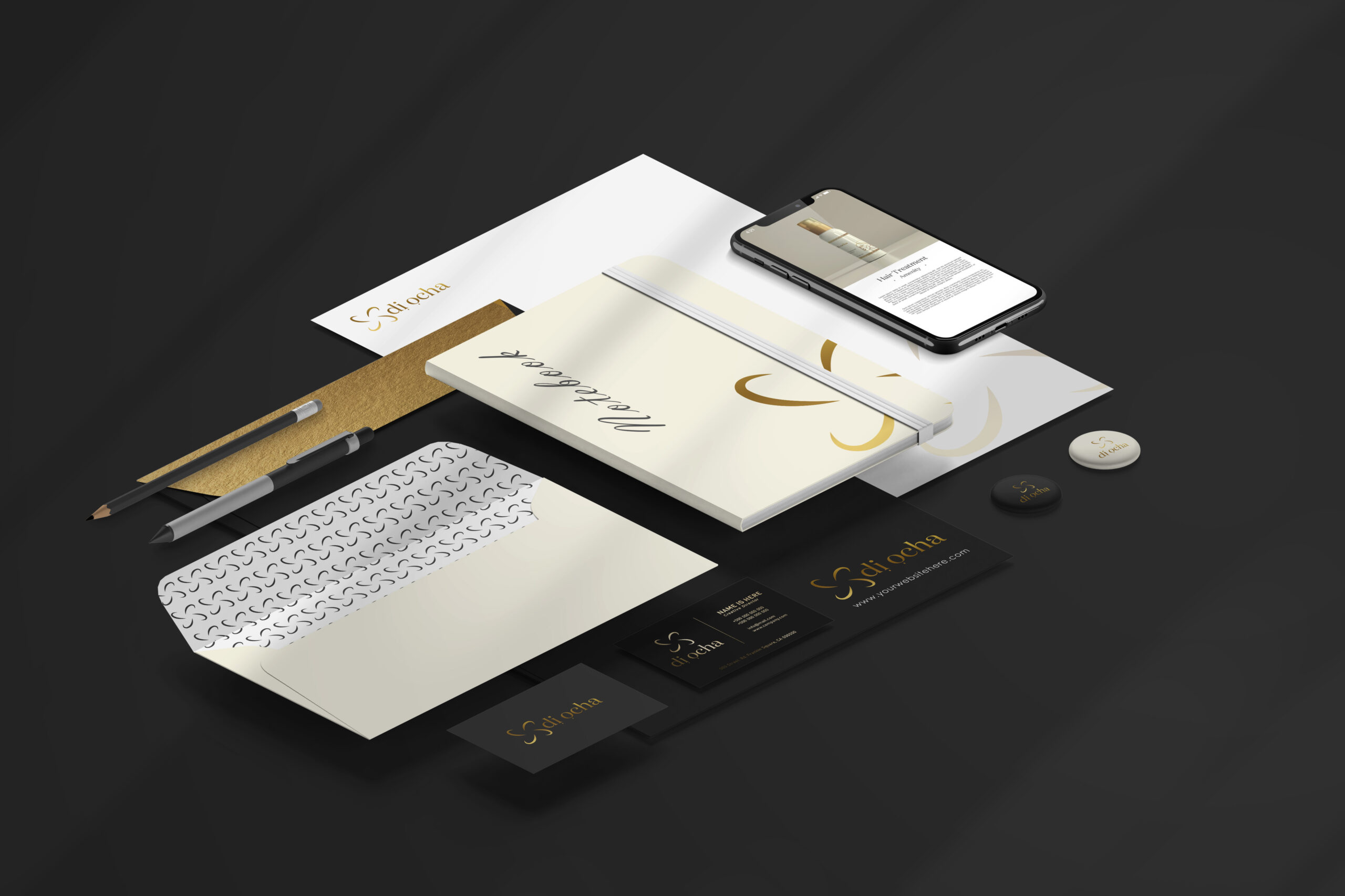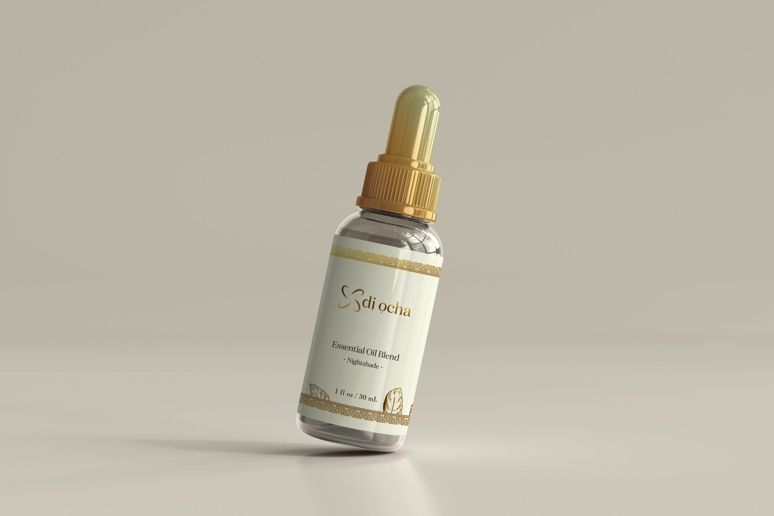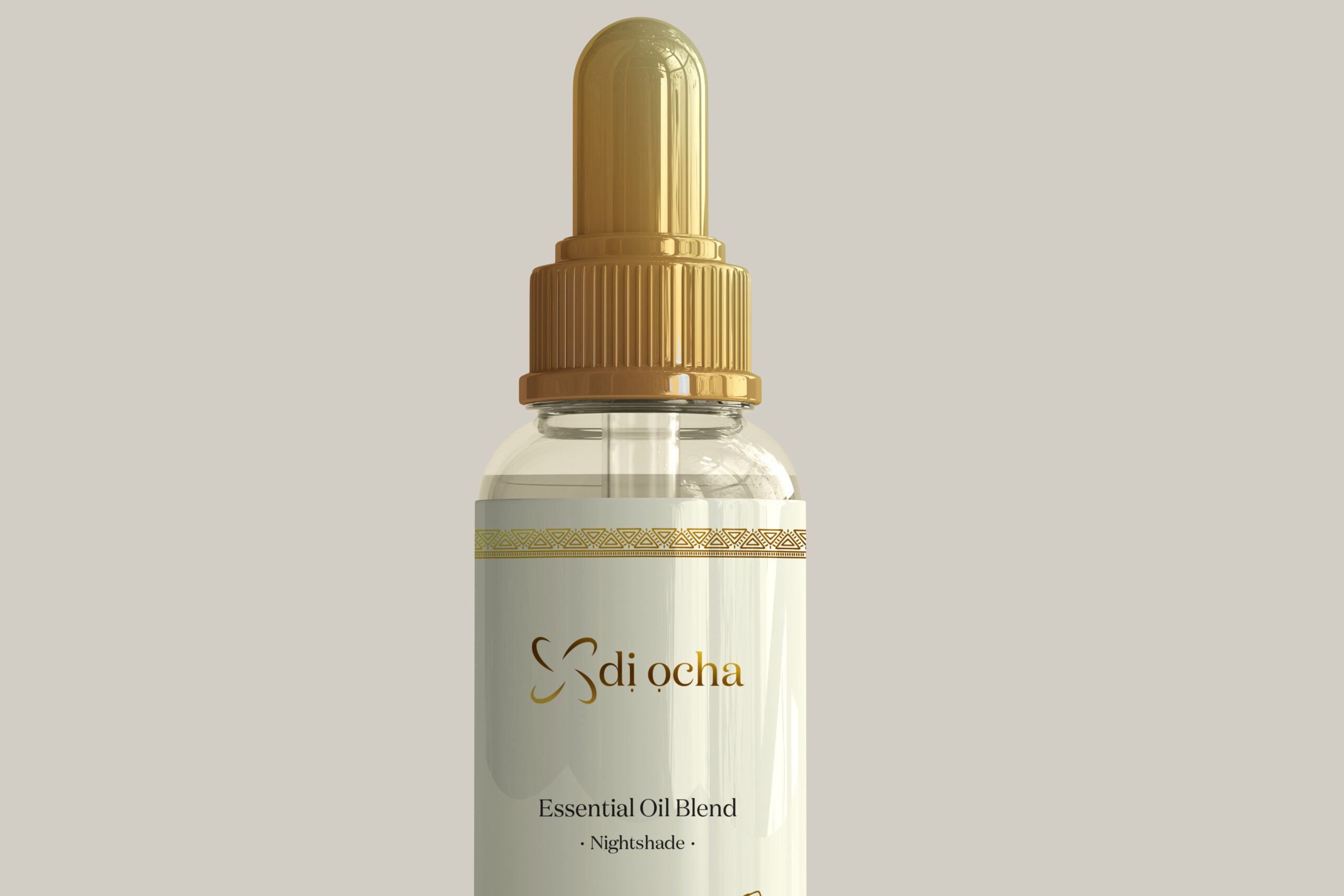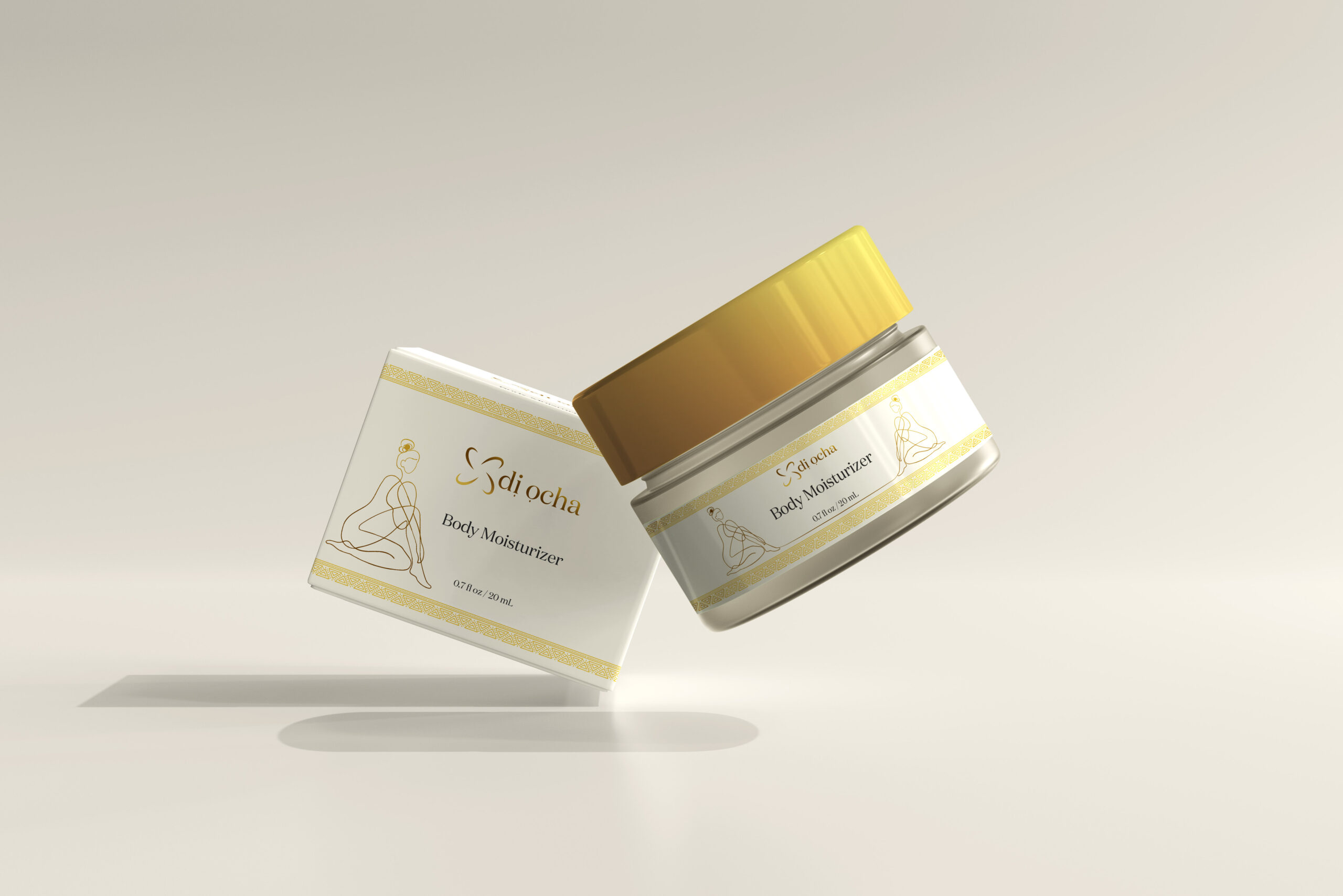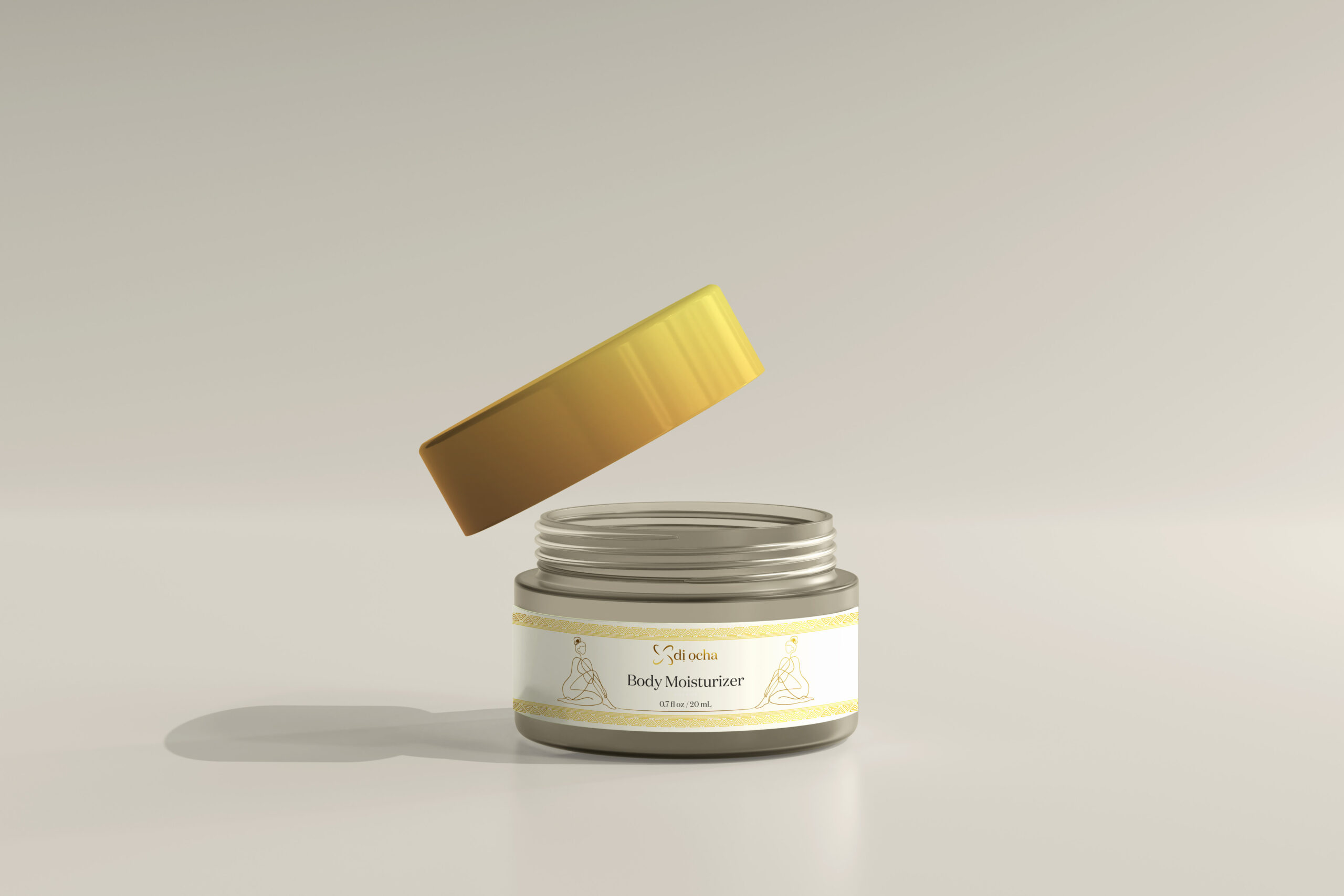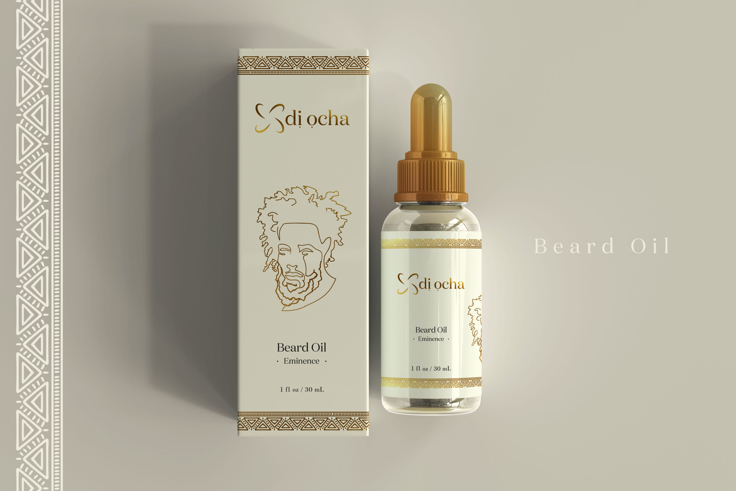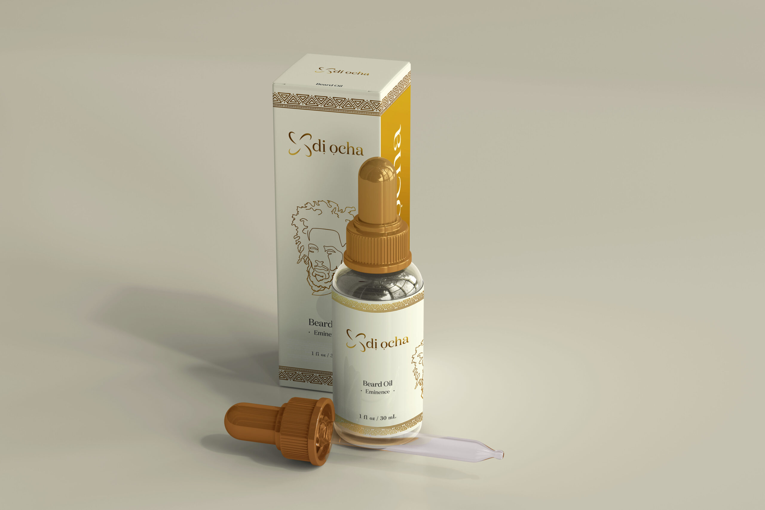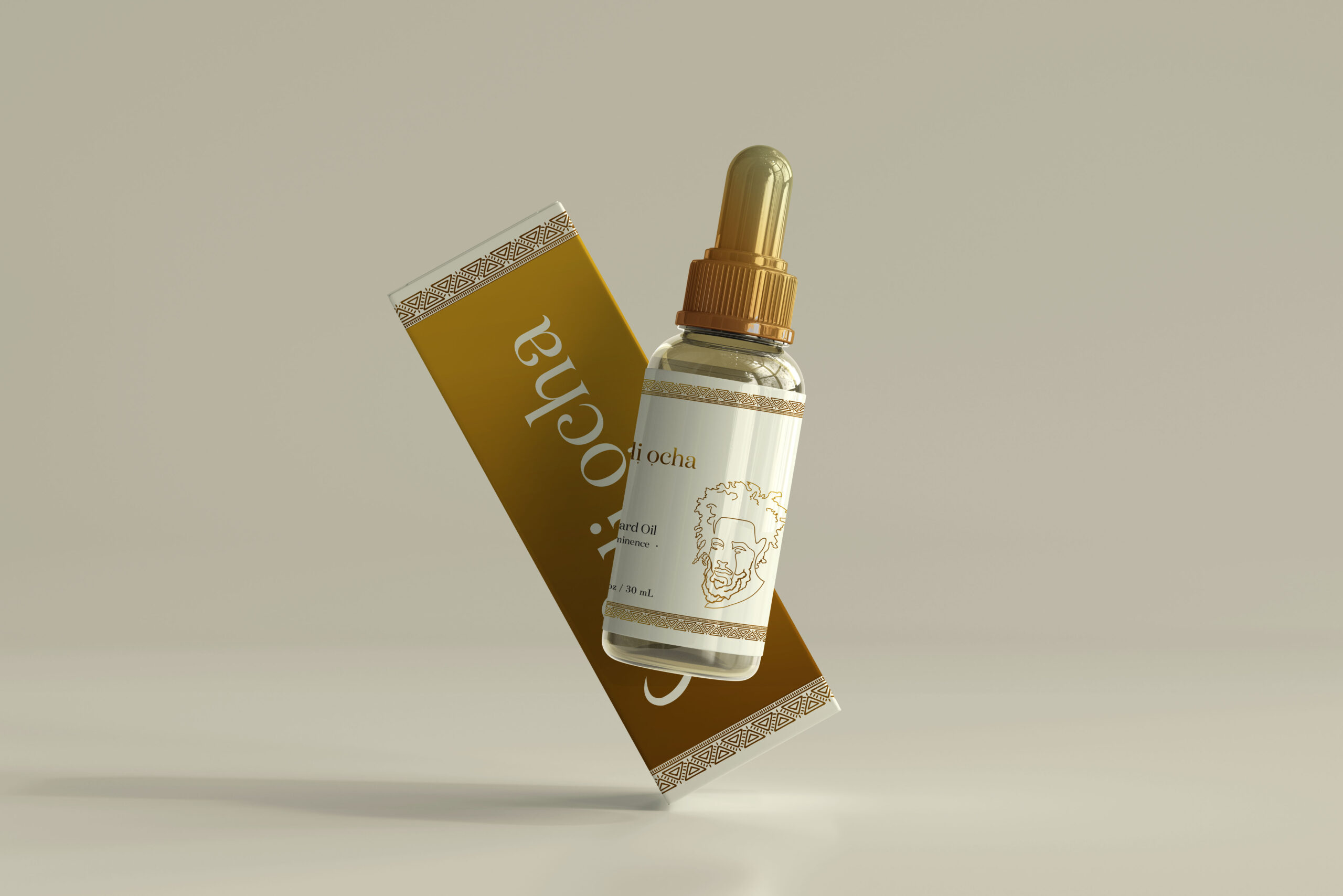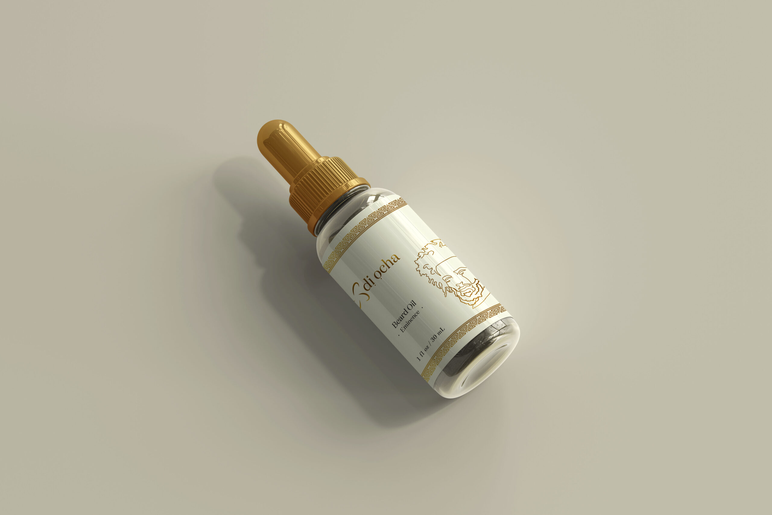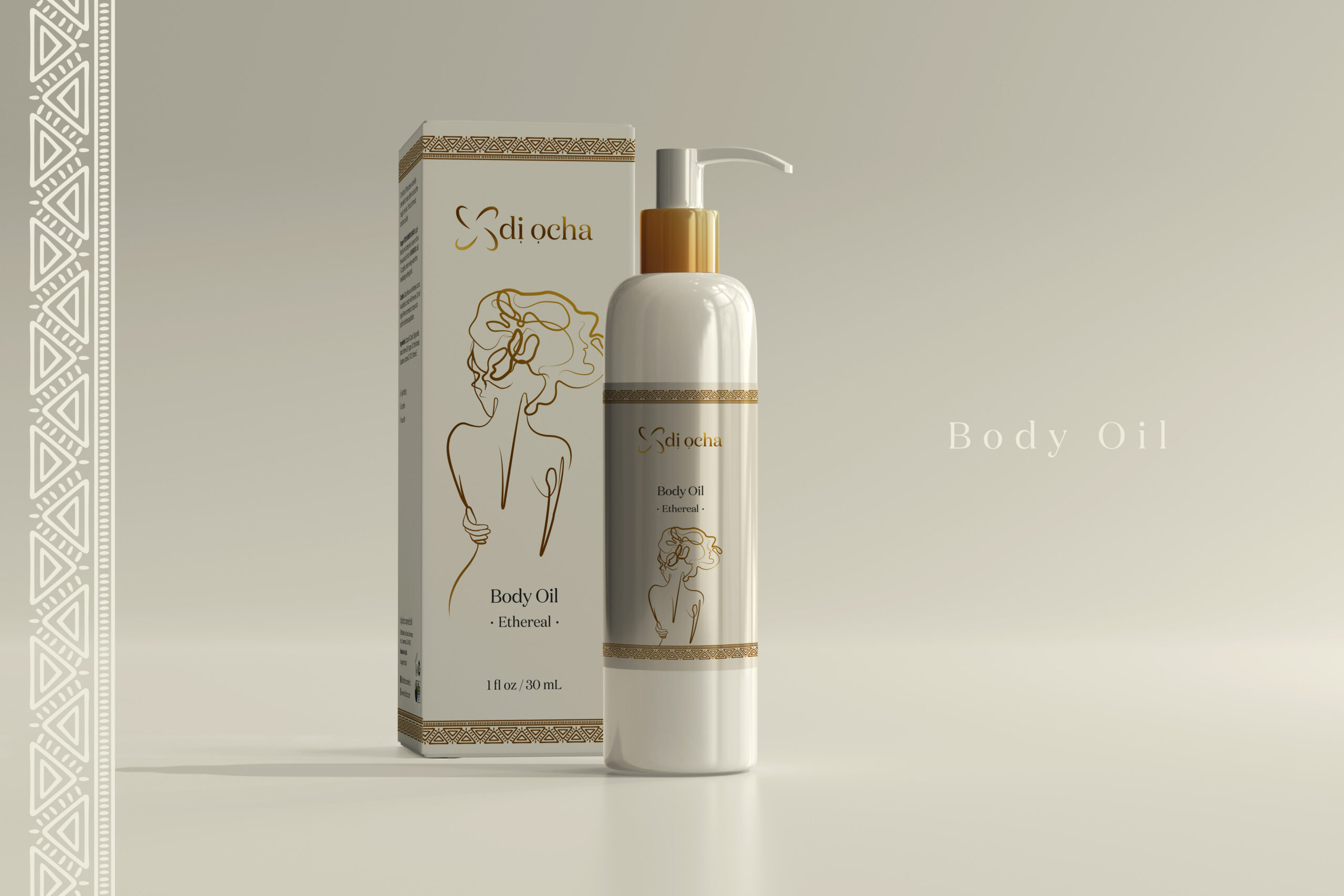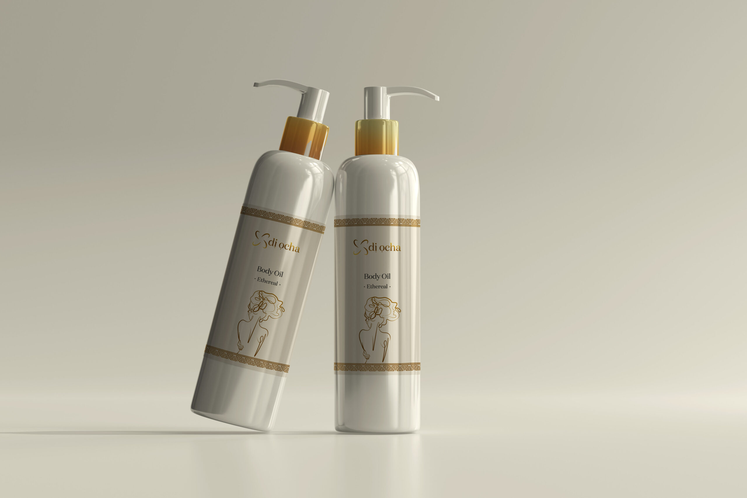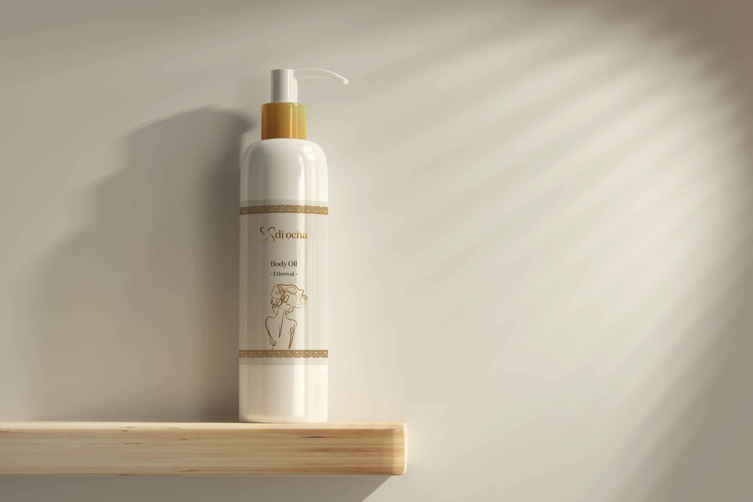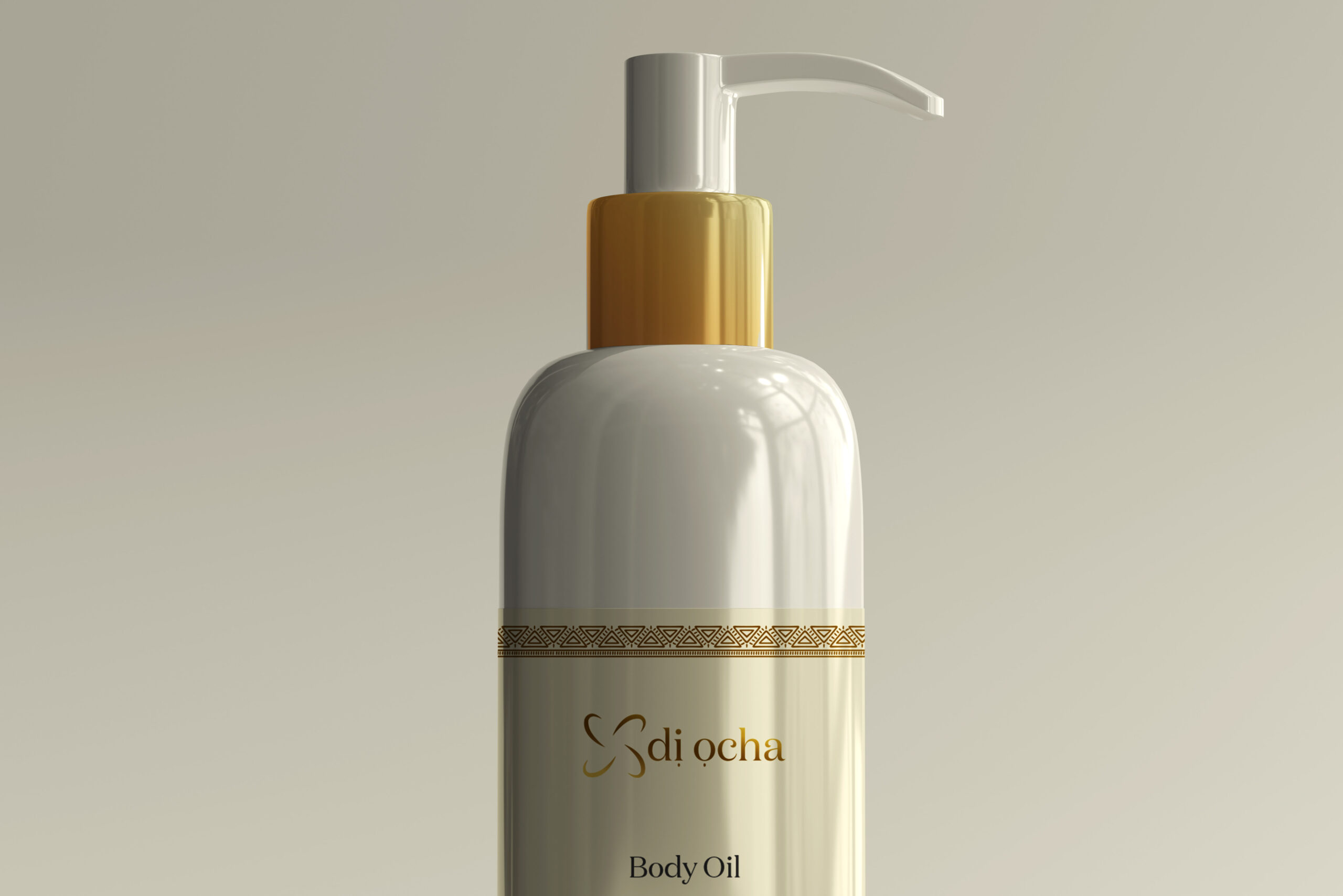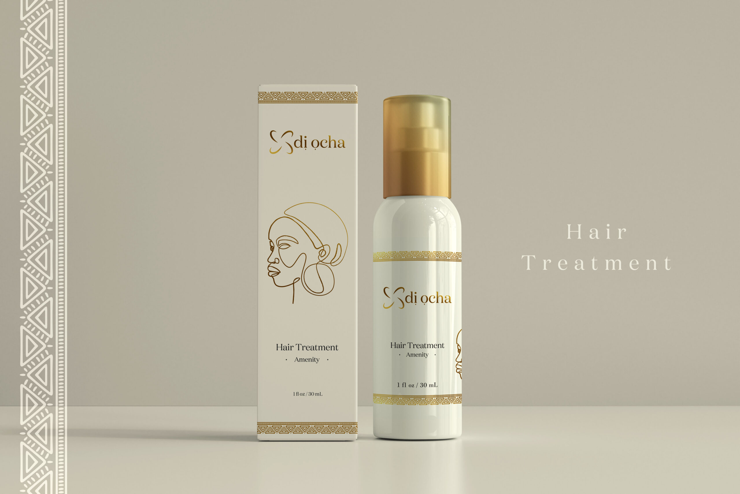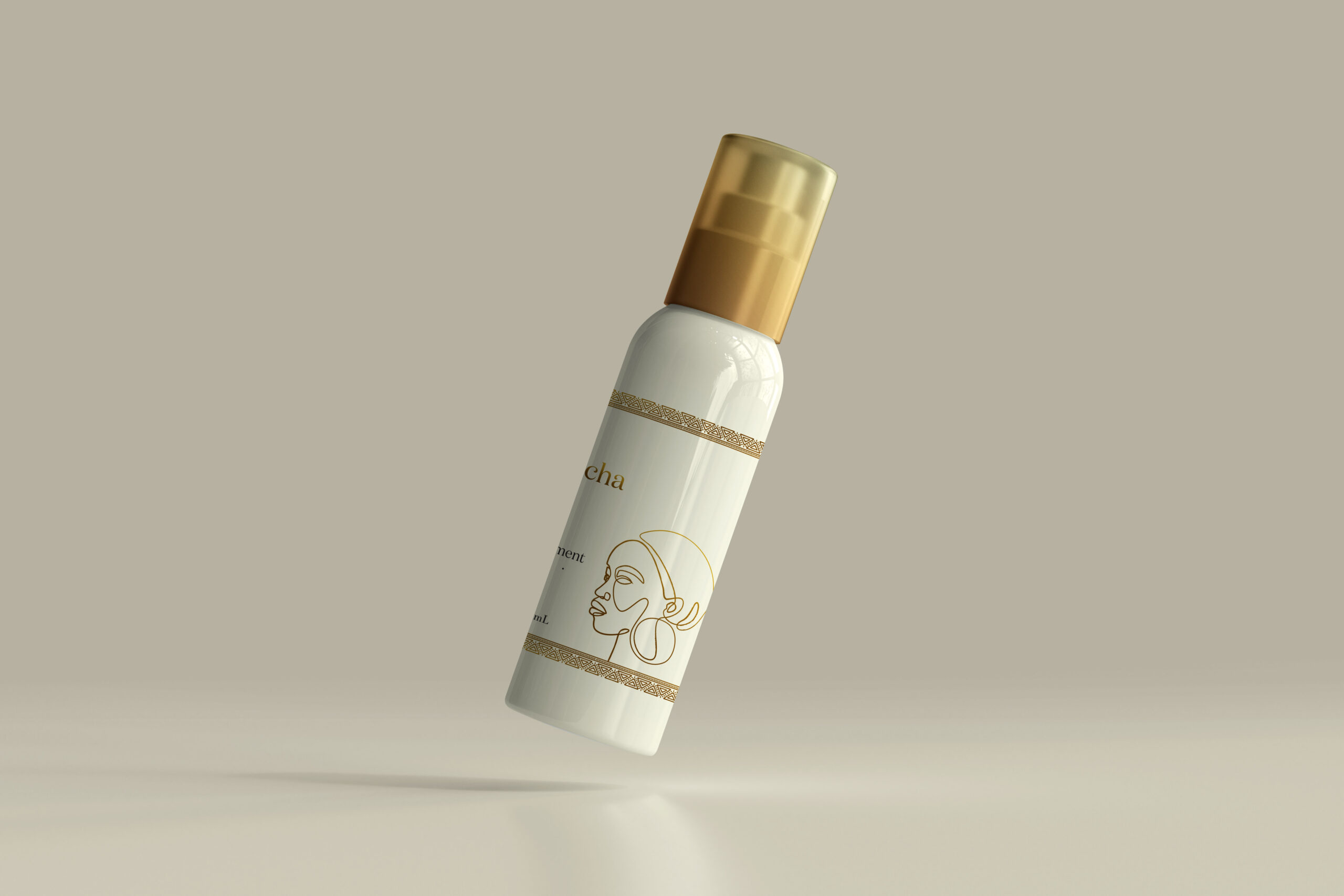

Di Ocha entered the skincare market with a strong foundation, premium African ingredients and a genuine passion for quality. What they needed was a visual identity that matched that ambition, something that felt as considered and authentic as the products themselves, and could carry the brand consistently across every touchpoint from first impression to shelf presence.
The Challenge
The Approach
The creative direction was rooted in research. Rather than following current design trends, I went back to historical references, seeking out symbols that carried genuine meaning around quality and luxury, and weaving them into a brand identity that felt timeless rather than fashionable. The result was a logo, typography, and colour system that communicated heritage and sophistication from the very first glance.
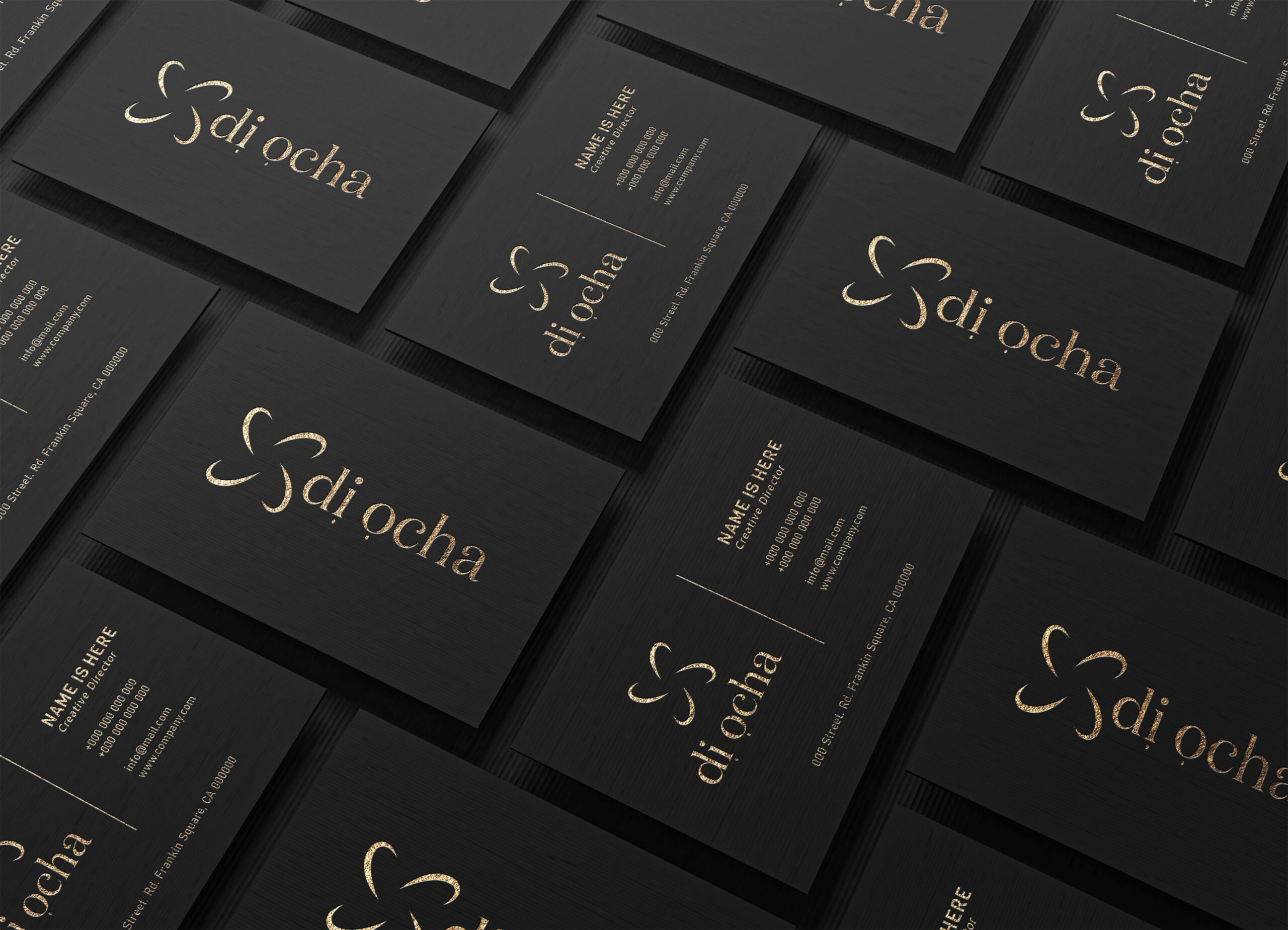
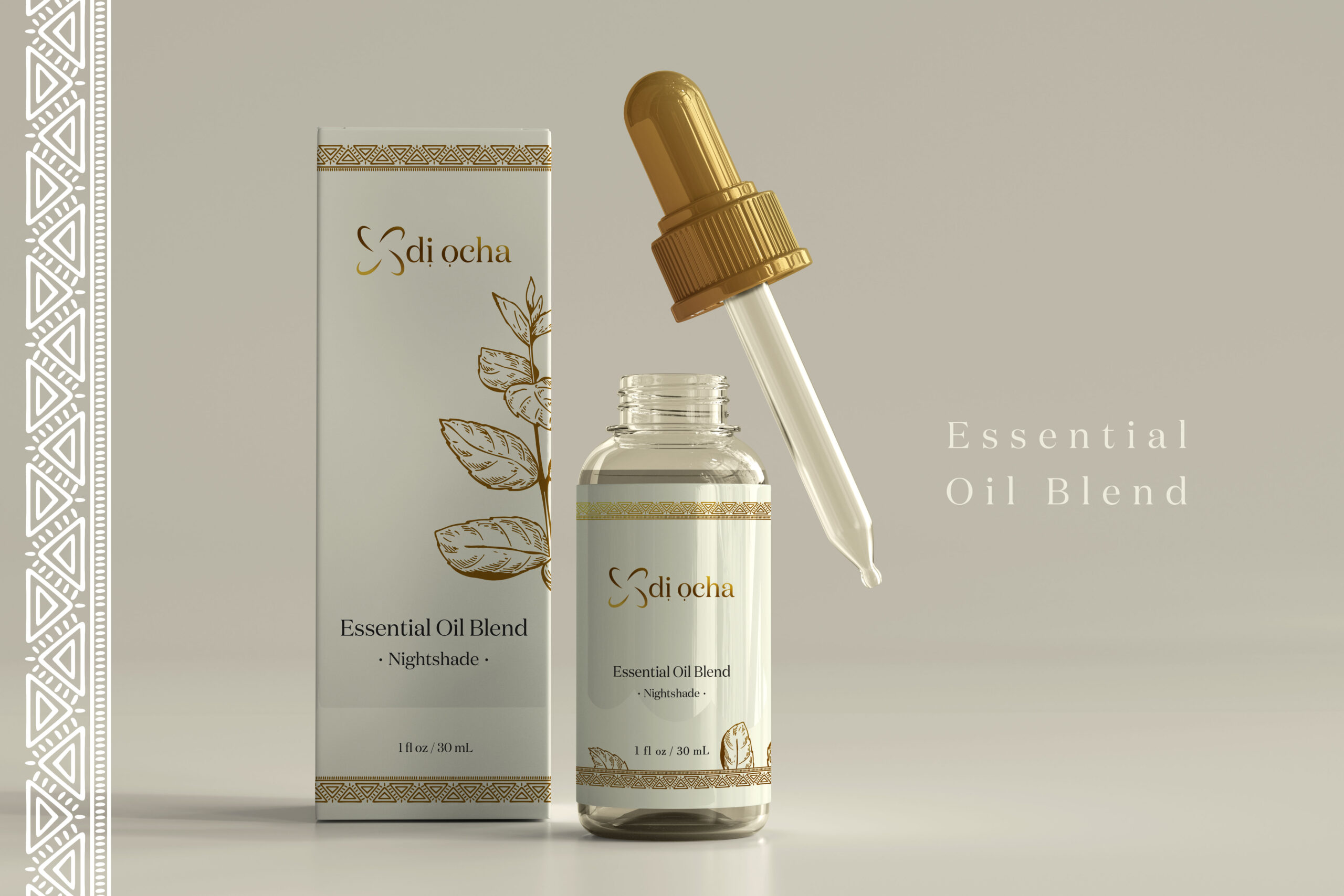
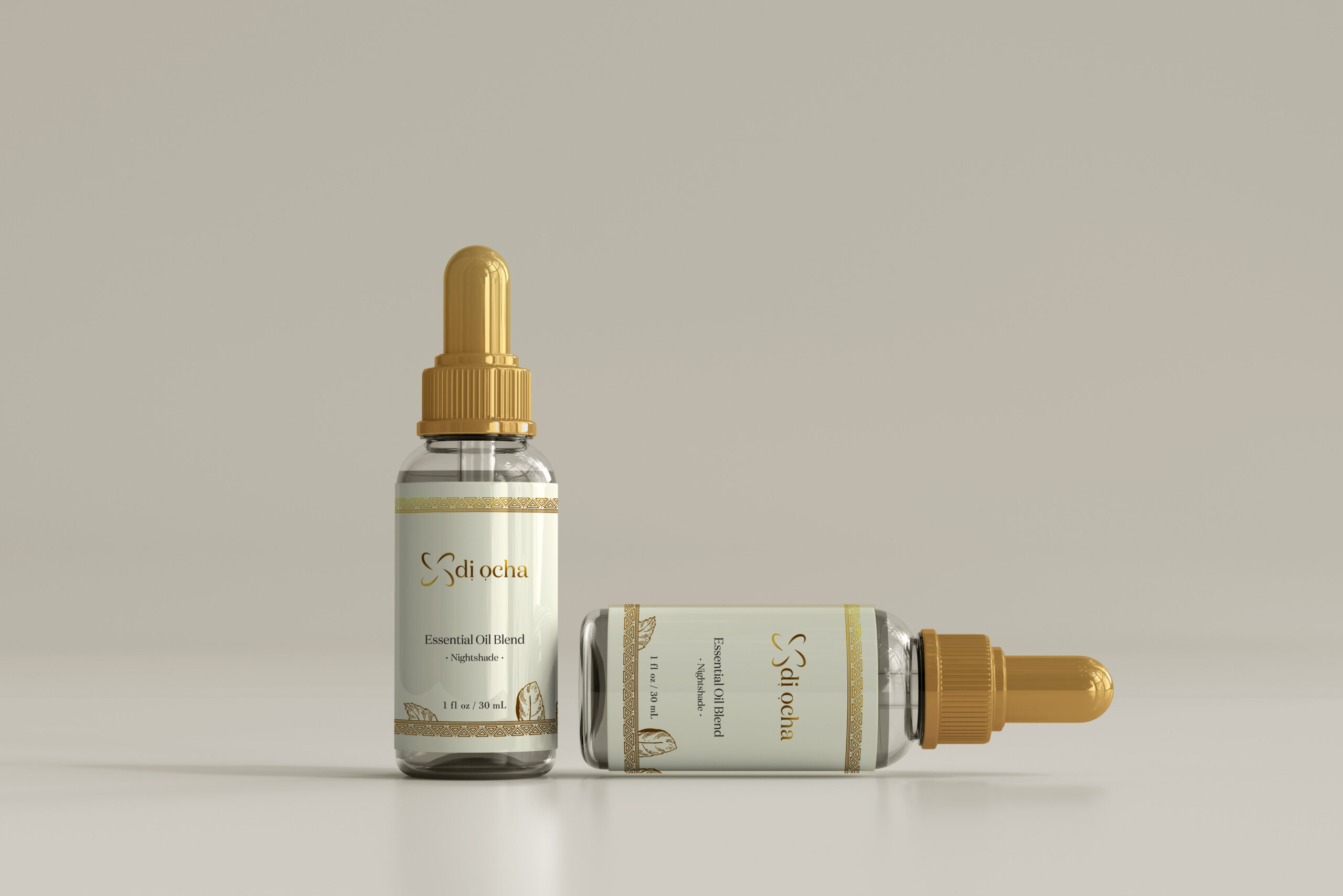
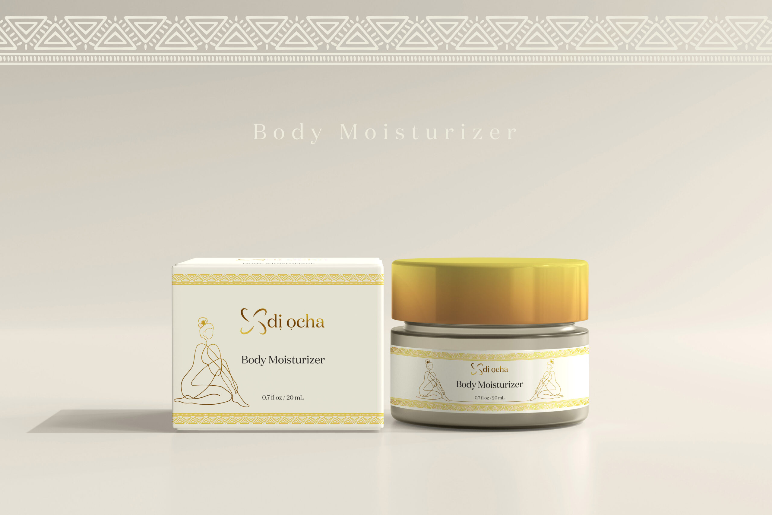
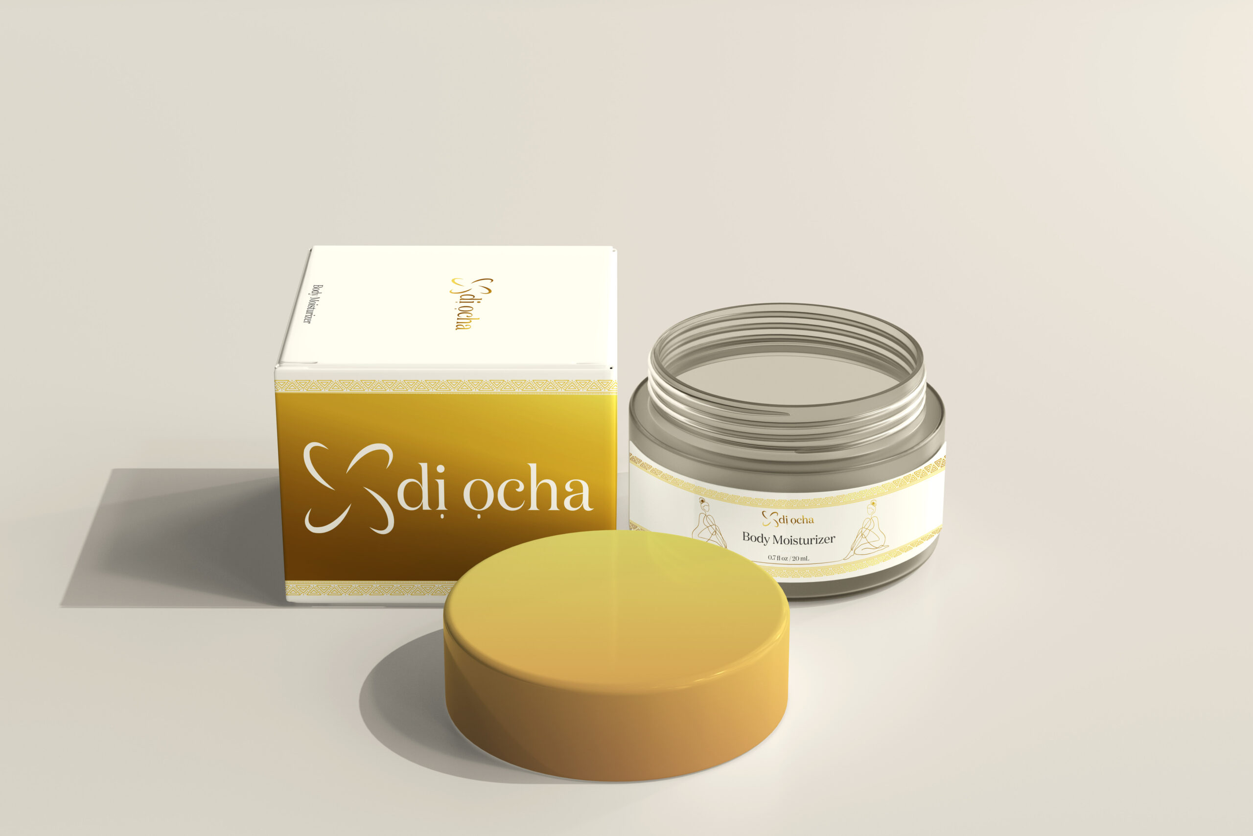
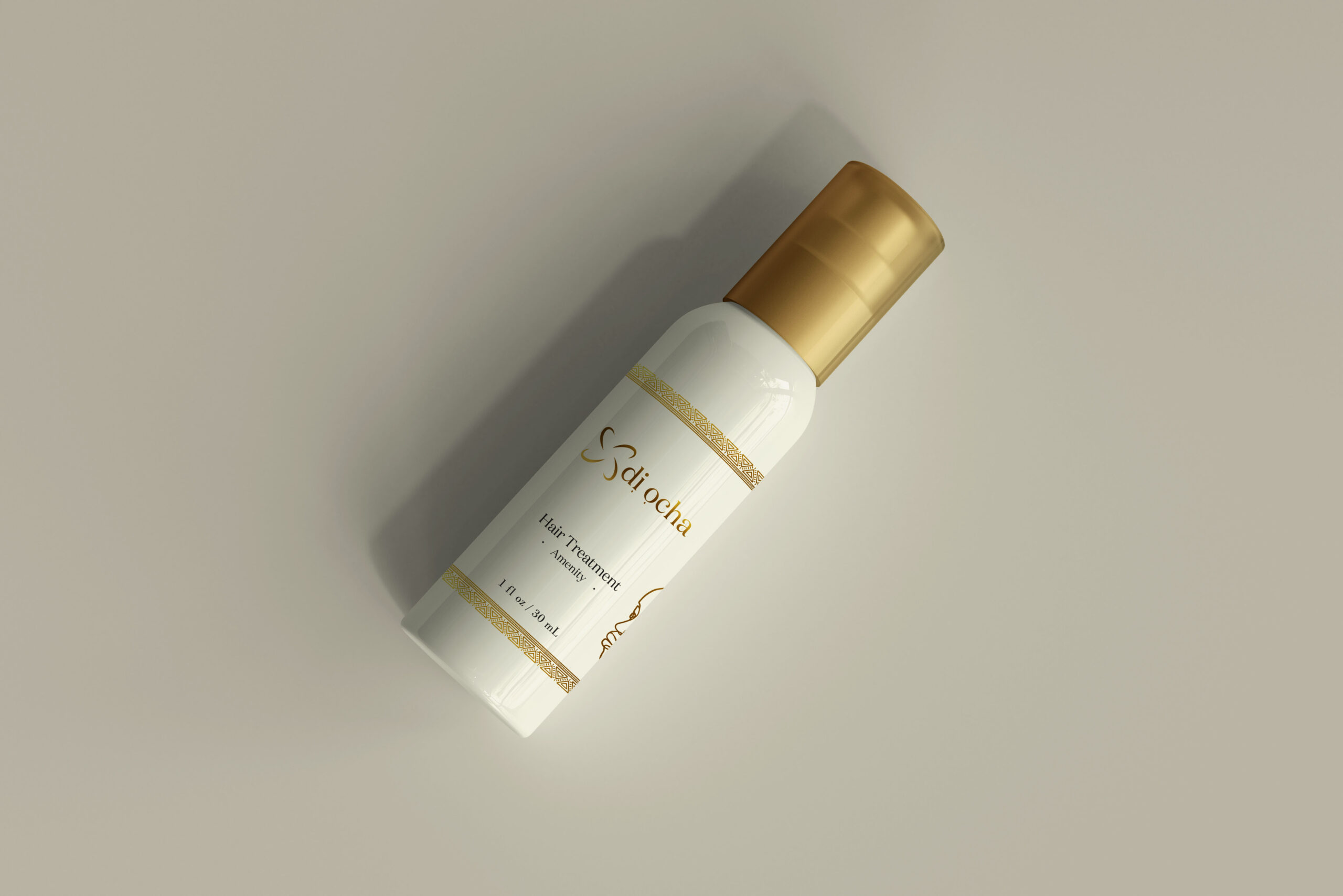
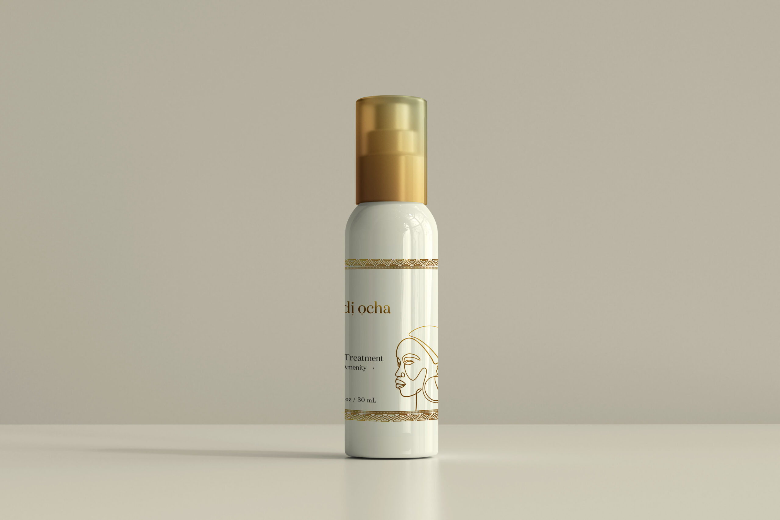
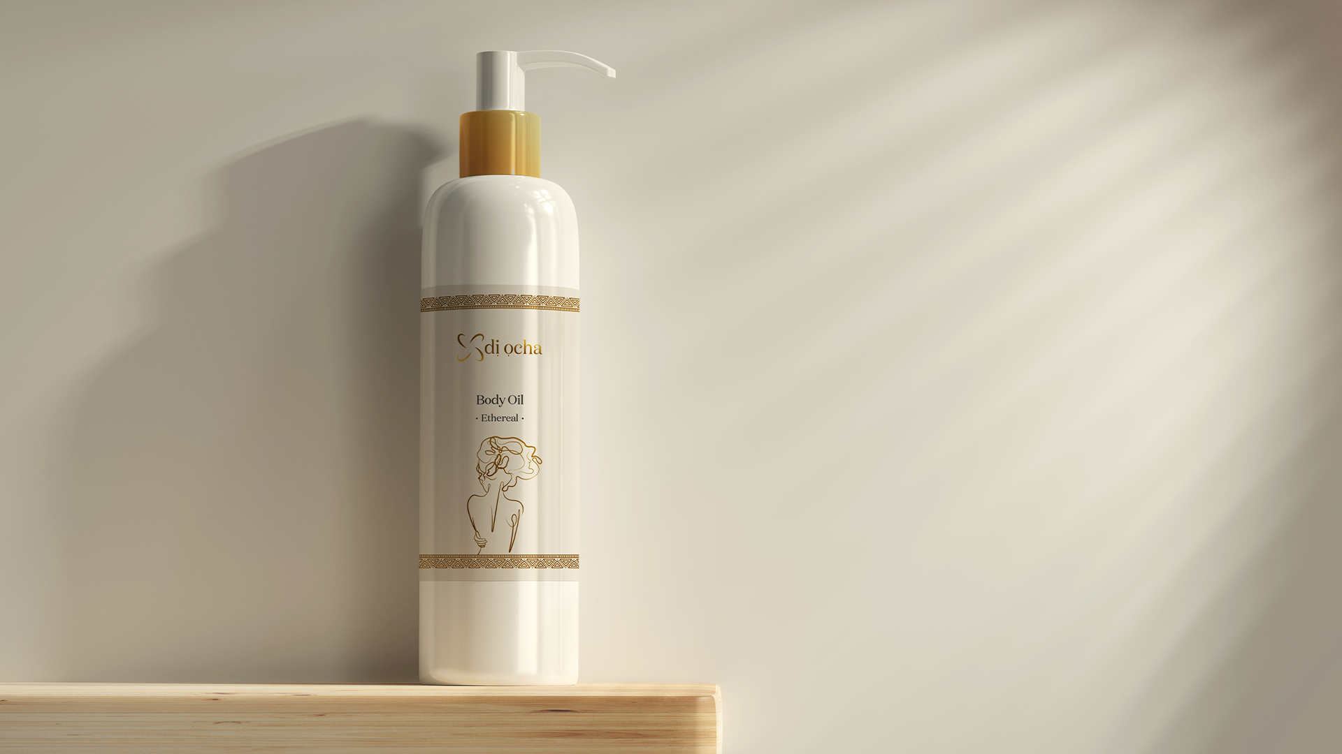
The client’s confidence in the initial identity led to a natural expansion of the collaboration, taking full ownership of their packaging and label designs across their entire product range, oil blends, moisturisers, beard oils, body oils, and hair treatments. For this I developed a one line drawing illustration style, a deliberate creative decision that balanced sophistication with artistry, giving the brand a distinctive visual language that was both refined and human. The same thinking extended across all printed materials, business cards, letterheads, email signatures, and beyond, ensuring total brand consistency at every touchpoint.
The Outcome
The creative direction landed on all fronts. The brand identity, packaging, and supporting materials were received with genuine enthusiasm by the client, with the one line drawing concept proving to be the perfect bridge between luxury positioning and creative personality. For a brand built on the richness of African heritage and ingredient quality, the visual identity gave Di Ocha the presence to stand confidently in a competitive skincare market.