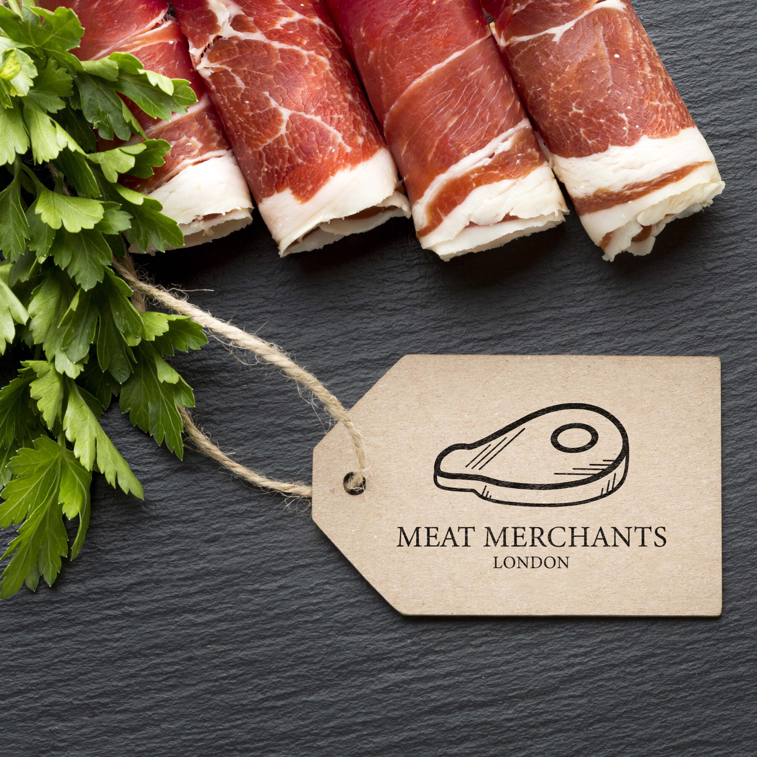

Meat Merchant London needed more than functional labels, they wanted a visual identity that stood out in a traditional industry where most competitors play it safe. The brief started with a logo, but the real opportunity was to create something memorable that customers would notice, talk about, and remember.
The Challenge
The Approach
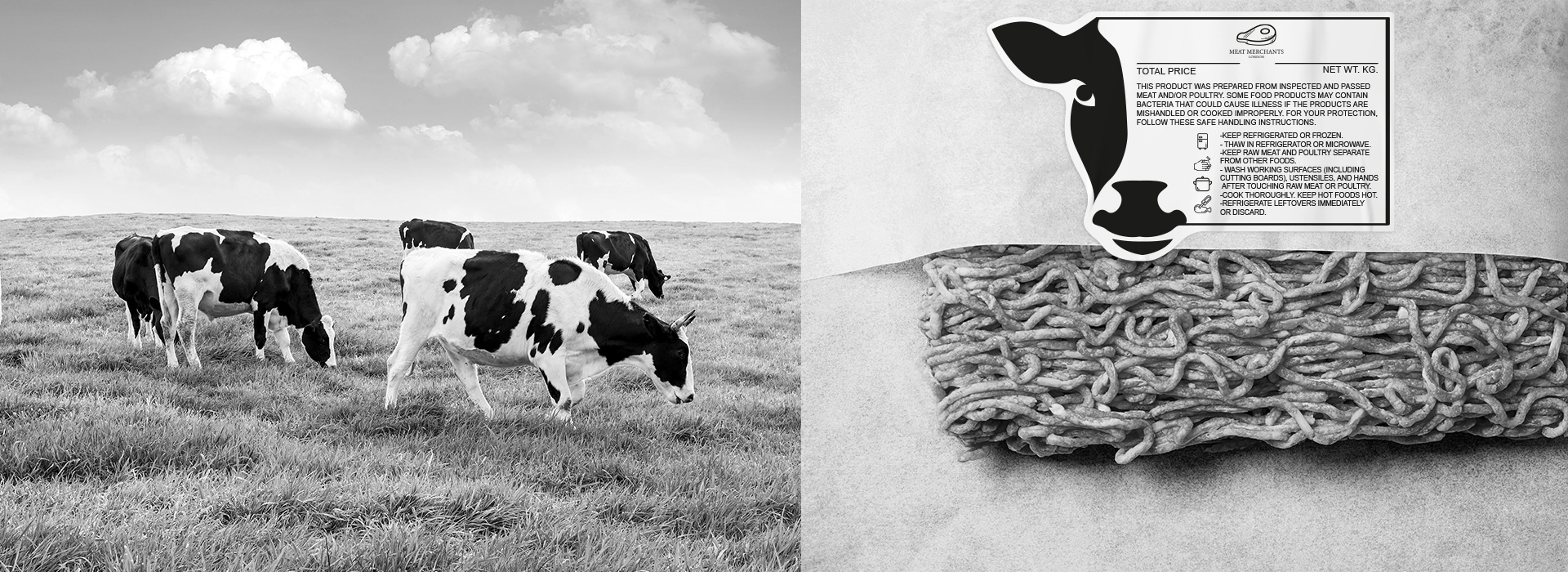
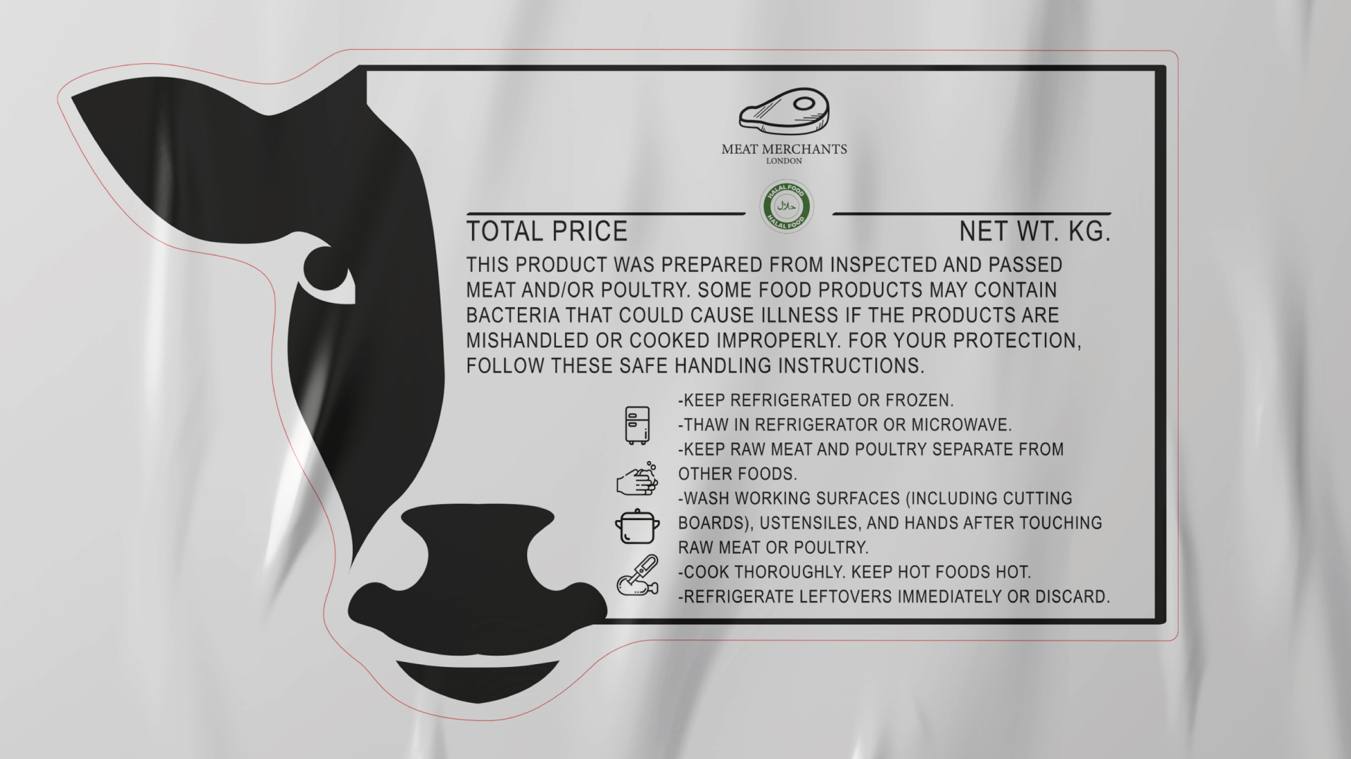
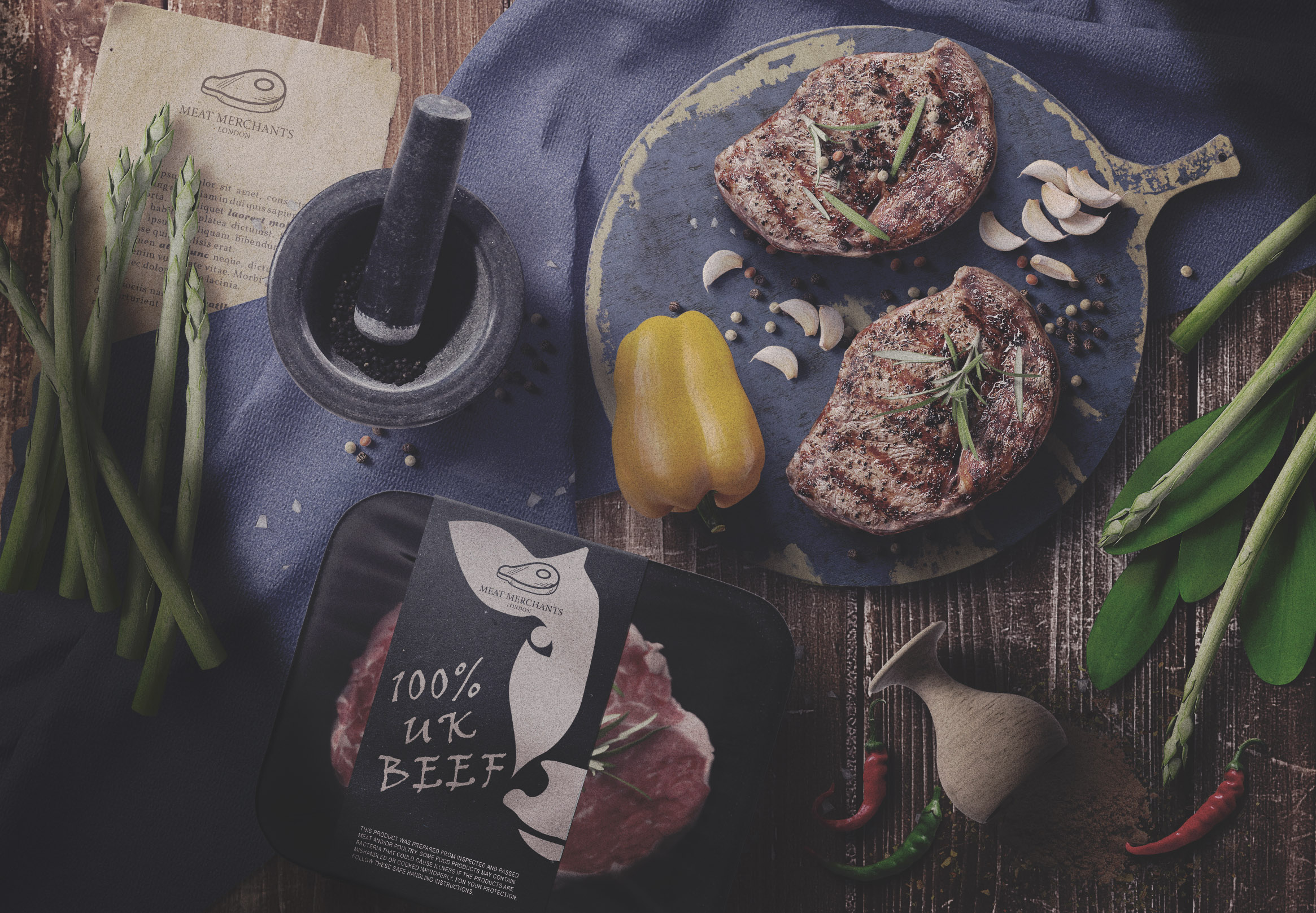
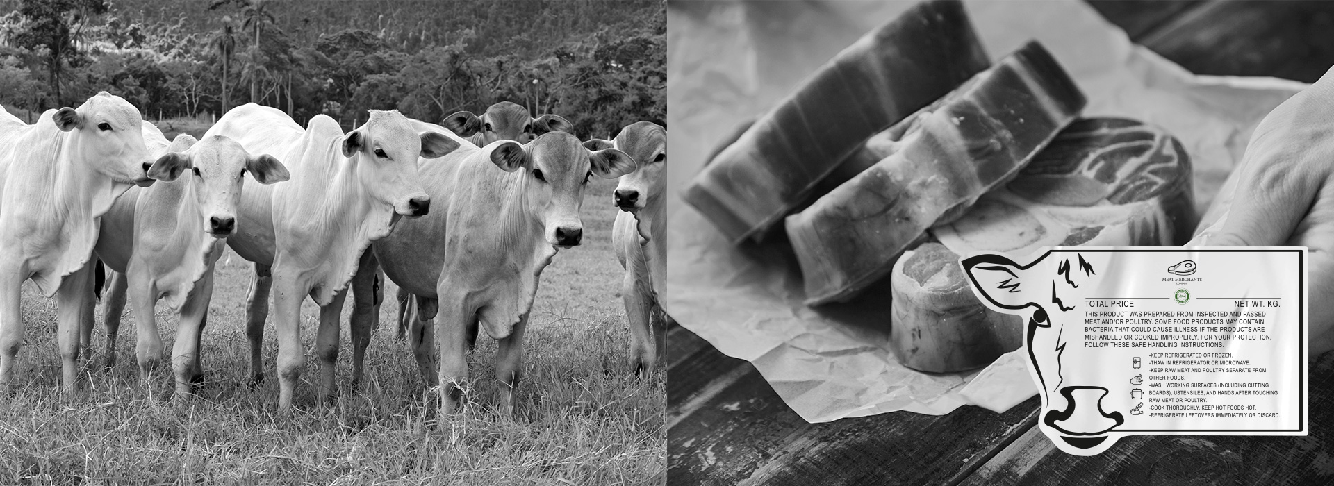
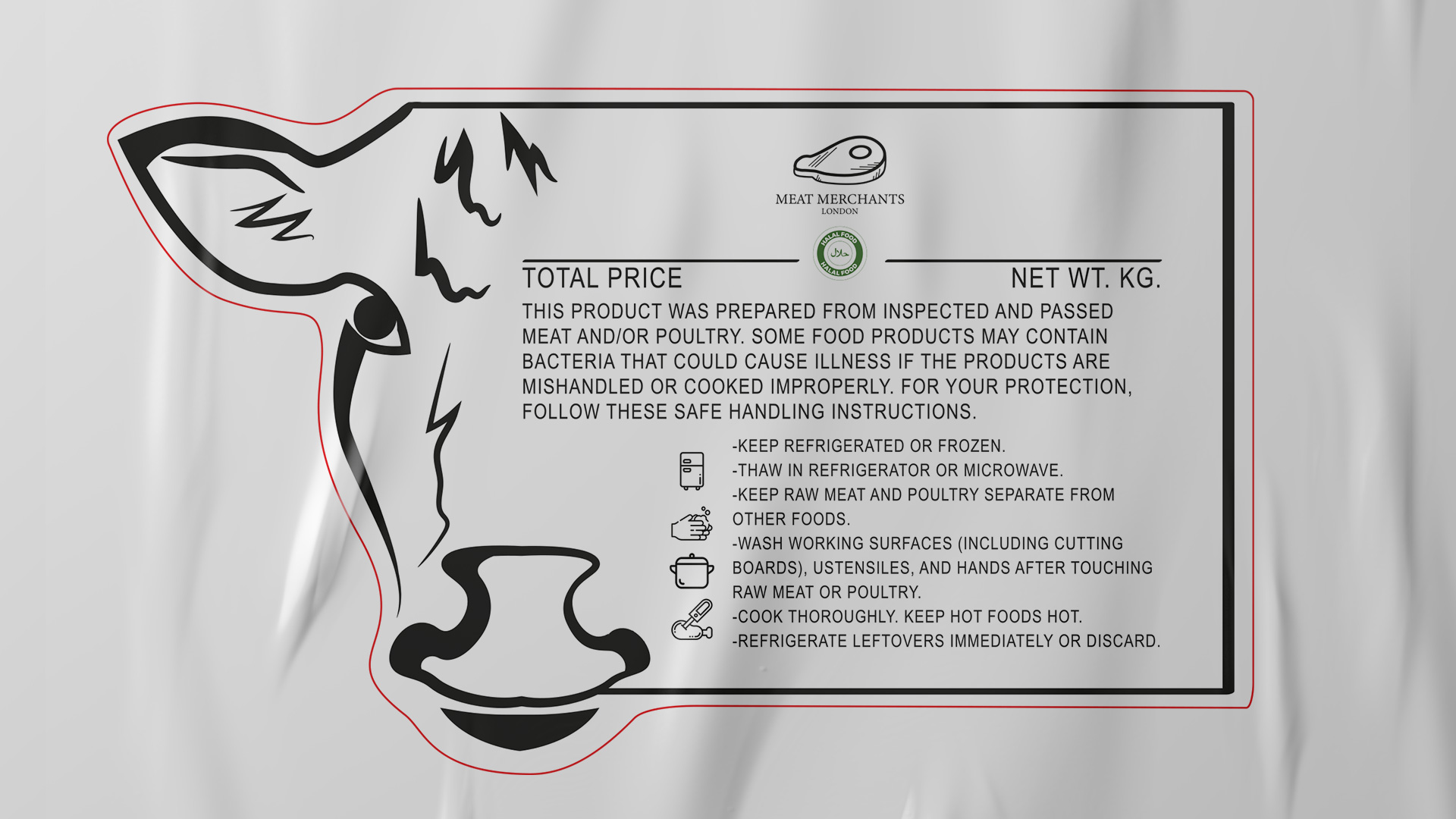
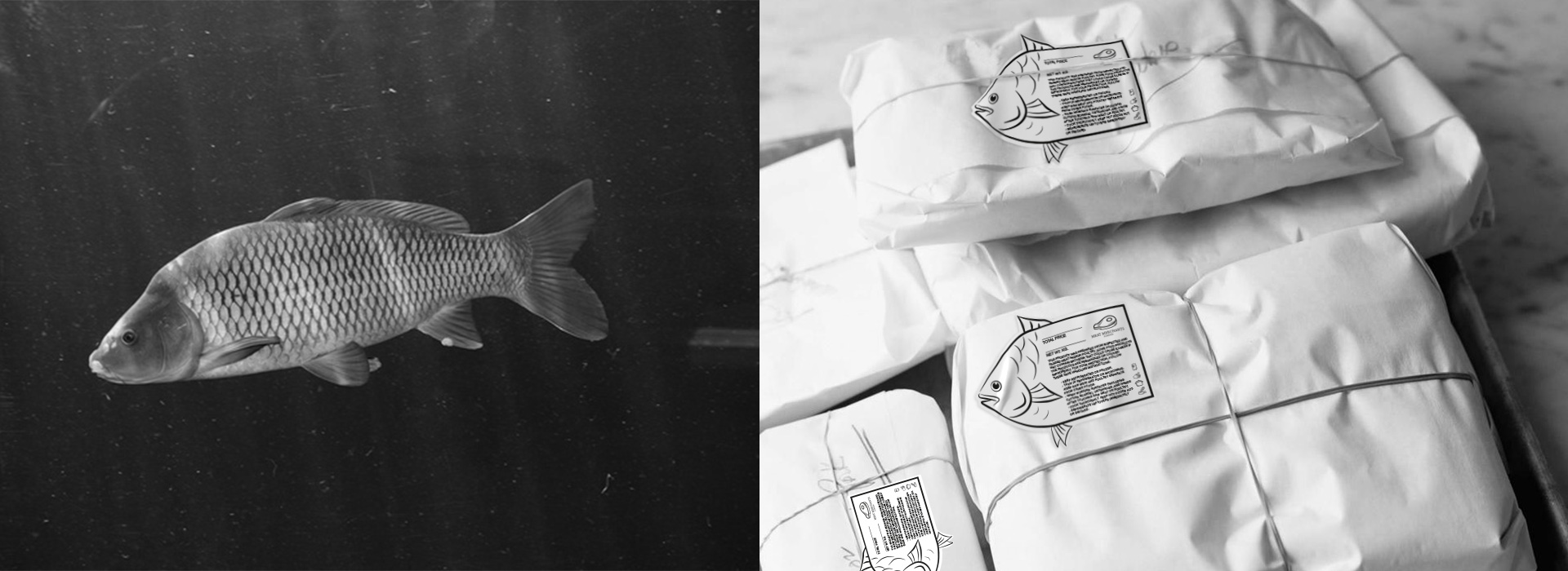
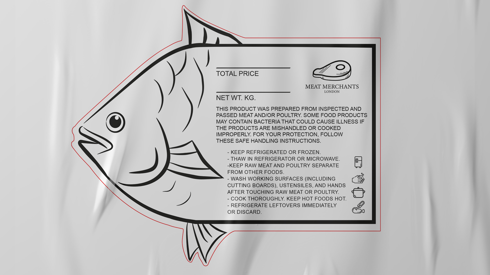
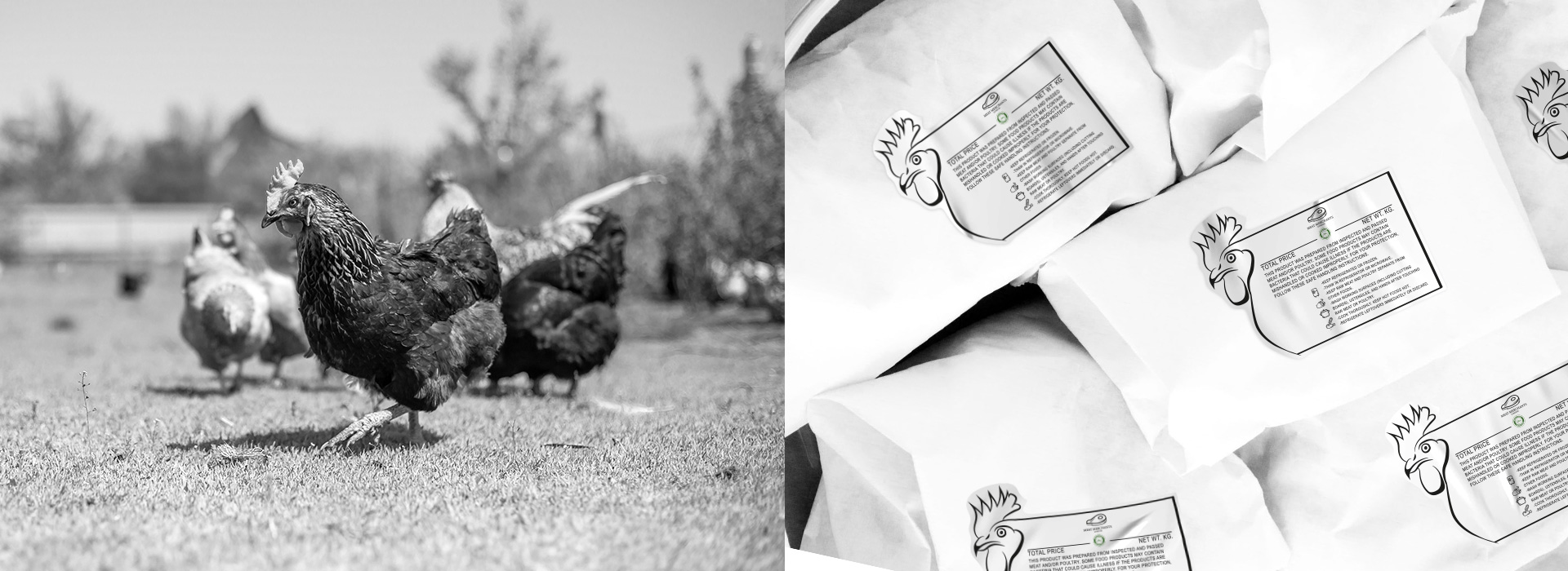
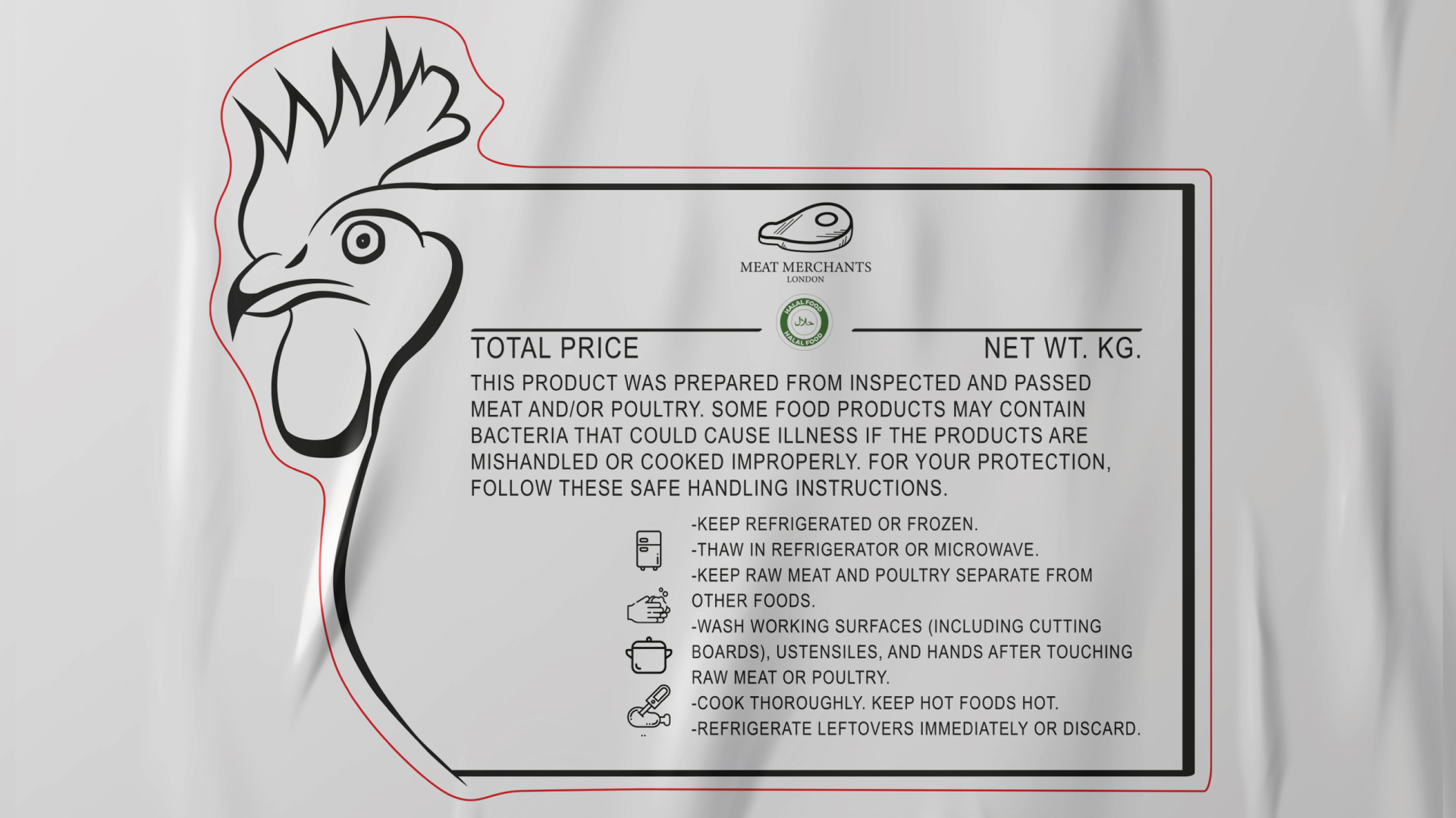
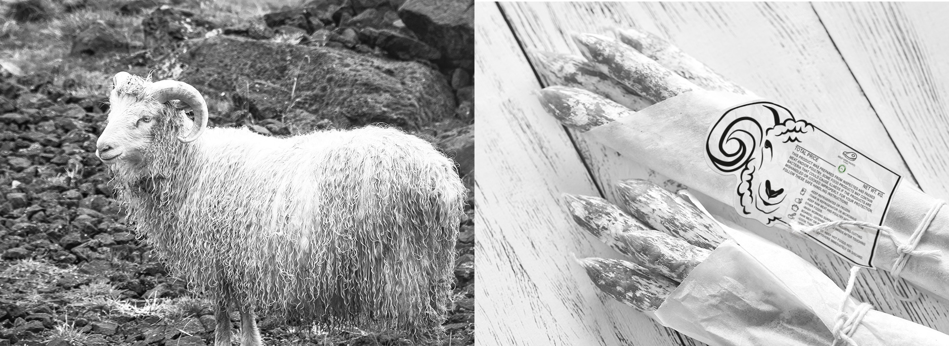
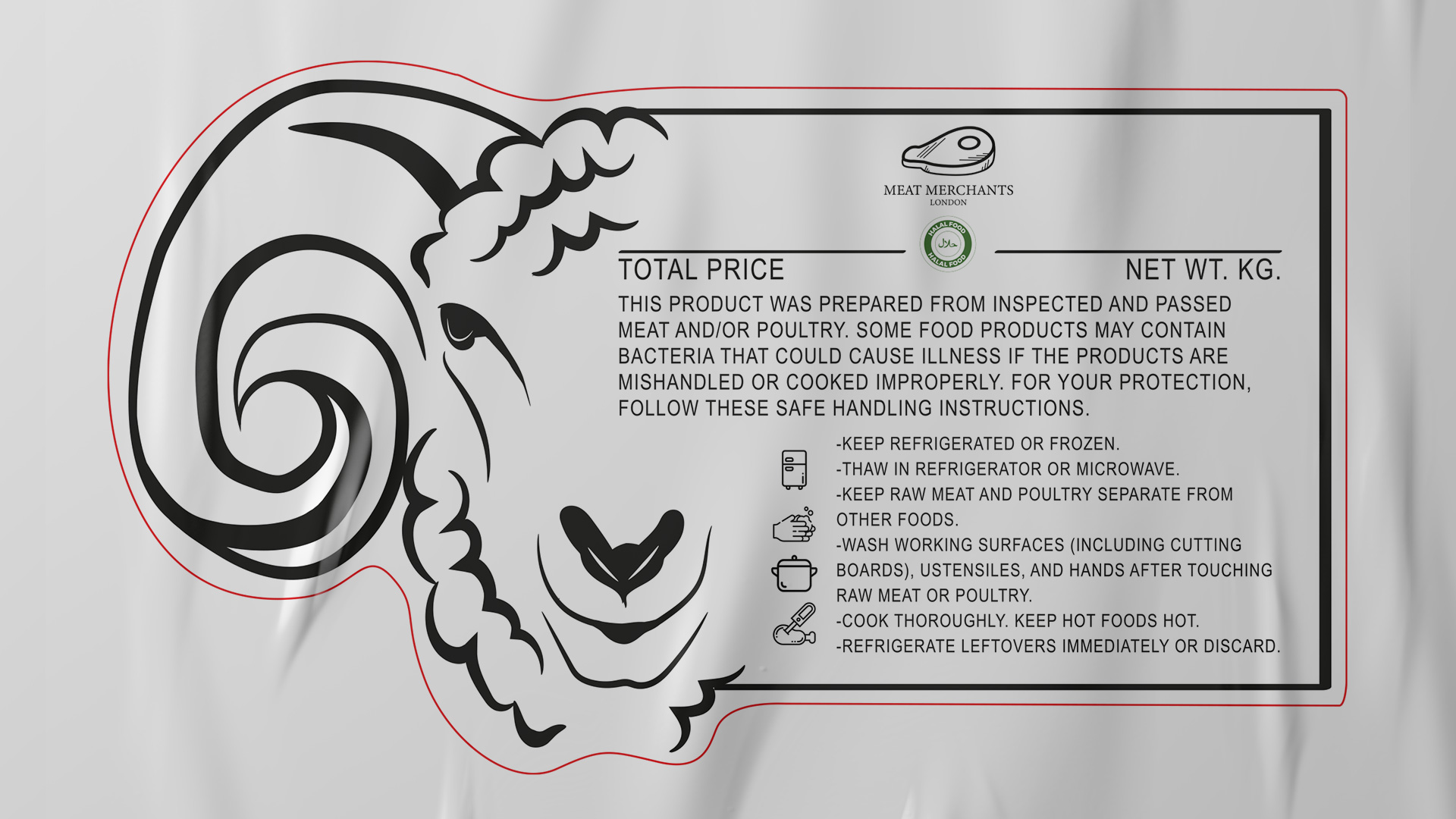
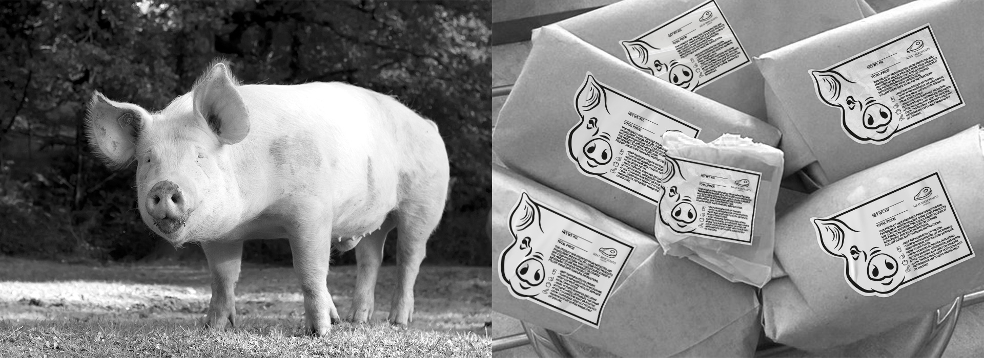
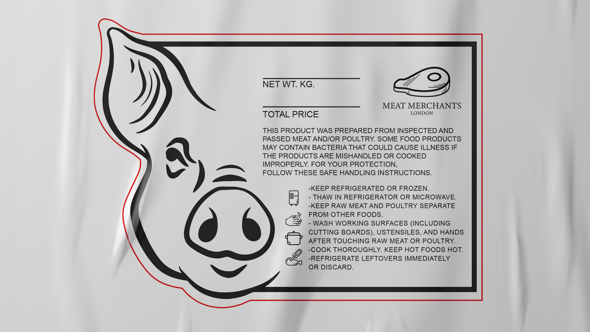
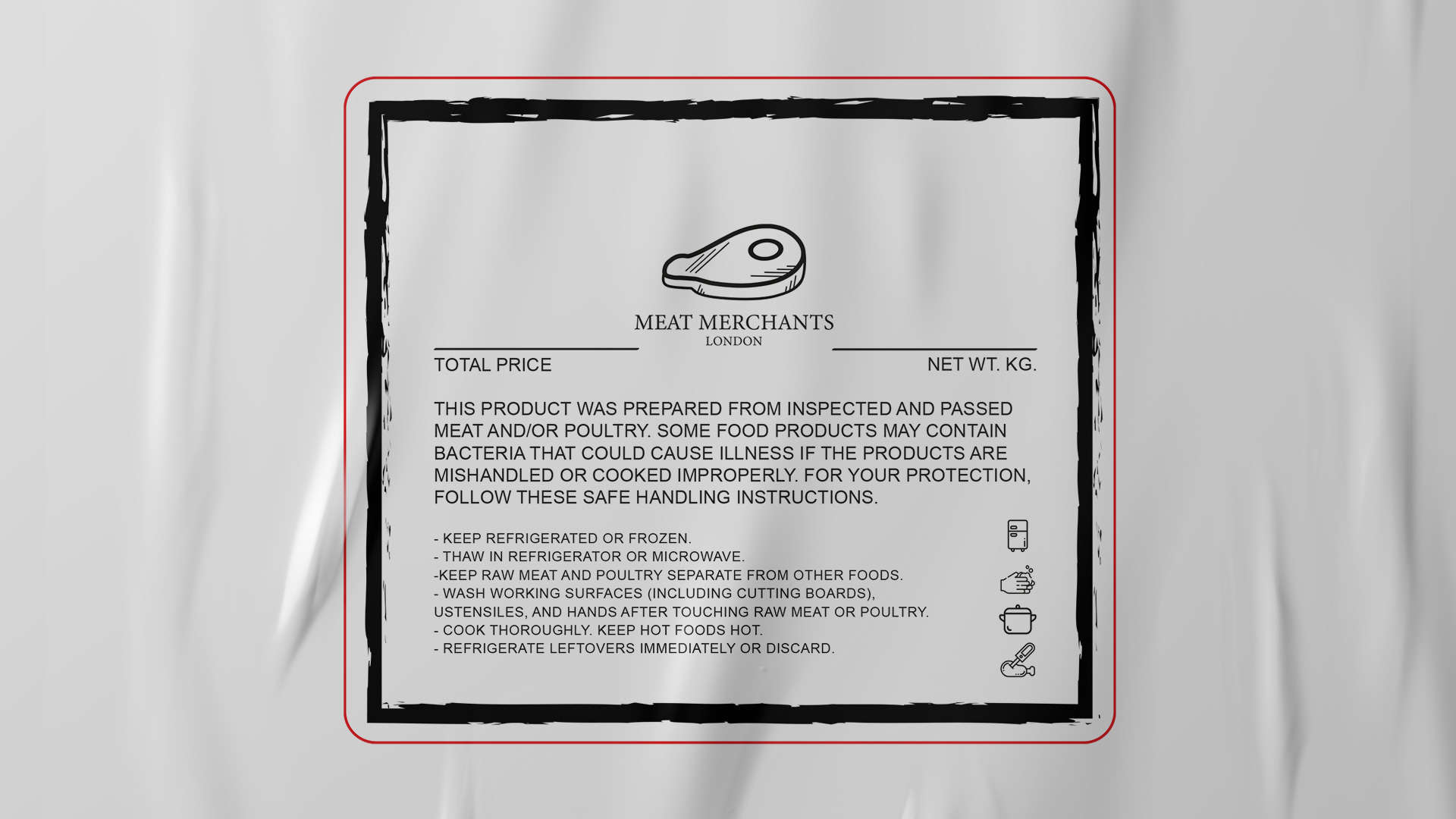
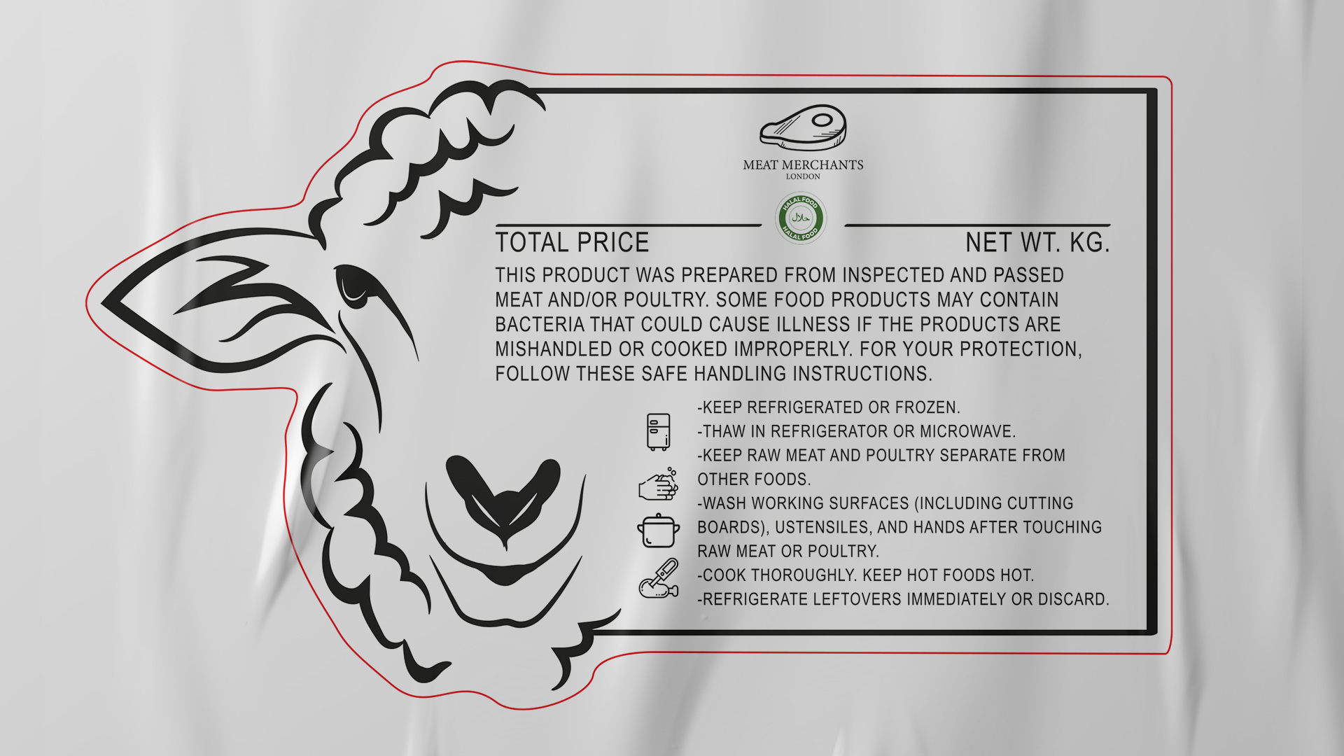
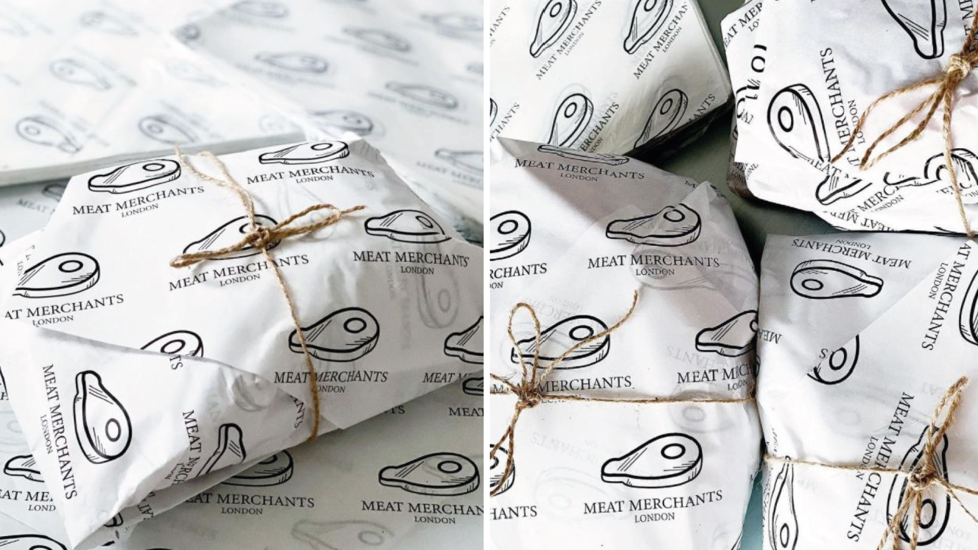
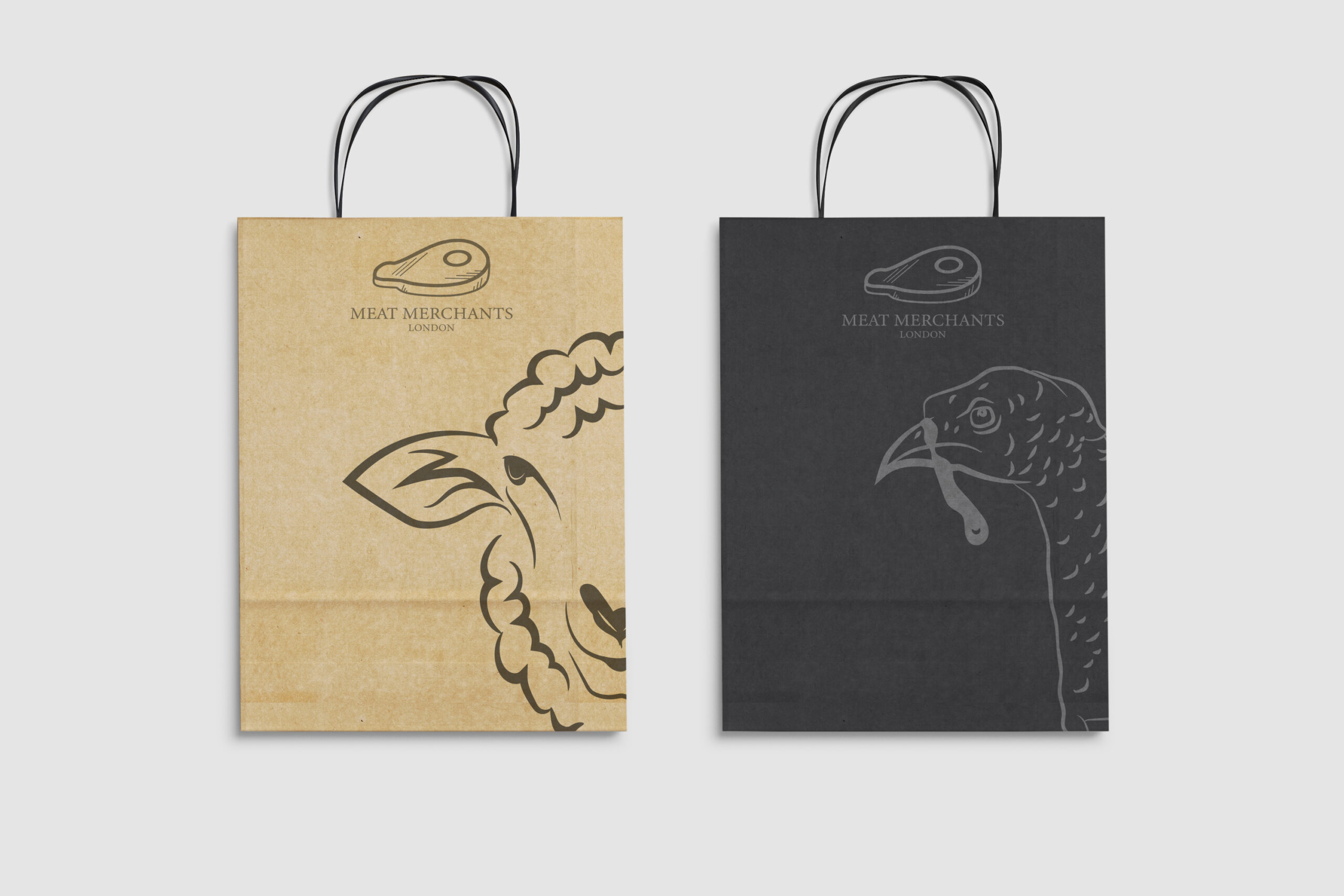
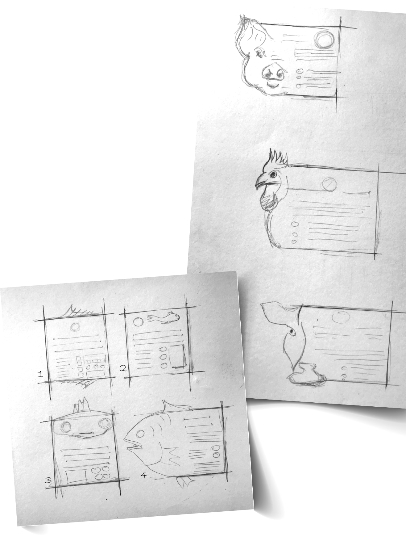
After establishing the logo, I developed a label concept that went beyond the standard. By combining the practical elements of a meat label with bespoke animal head illustrations specific to each cut, the packaging became a creative statement in its own right. The illustrations were deliberately simple, clean lines with strong character, striking enough to turn a everyday product label into something worth looking at twice. The wrapping paper carried the same visual language, giving the brand a cohesive and distinctive presence from counter to customer.
The Outcome
The concept impressed the owner immediately and has remained in use to this day, a strong indicator that the work stood the test of time and continued to serve the brand well beyond the initial project. Customers responded positively, with compliments on the new visuals becoming a regular part of the in-store experience.

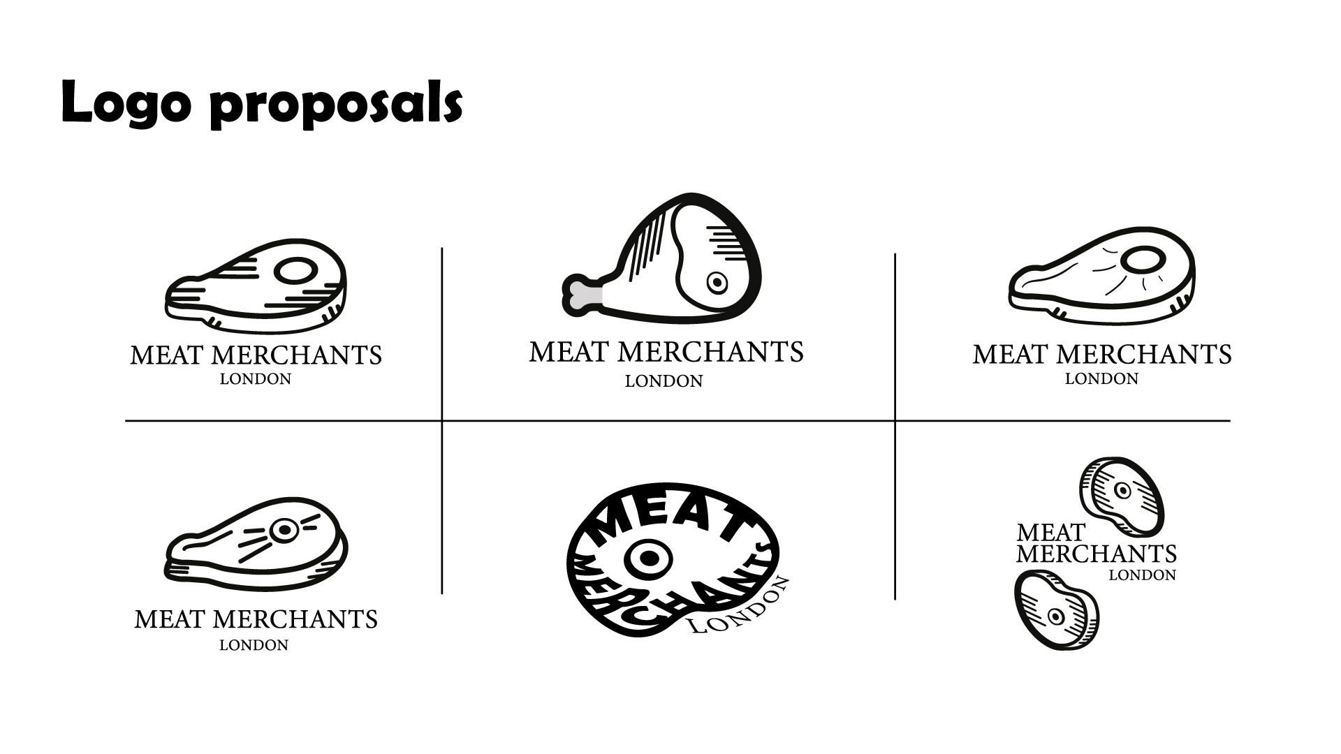
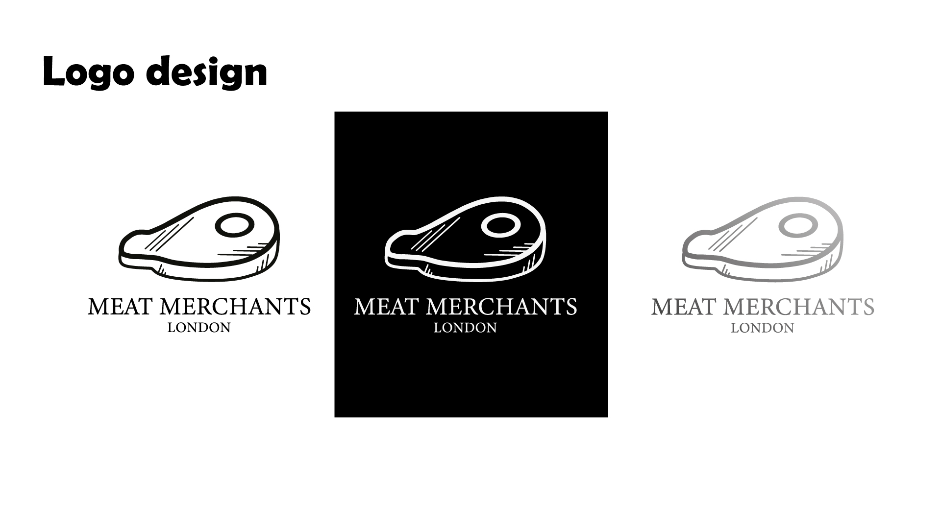
Proposal