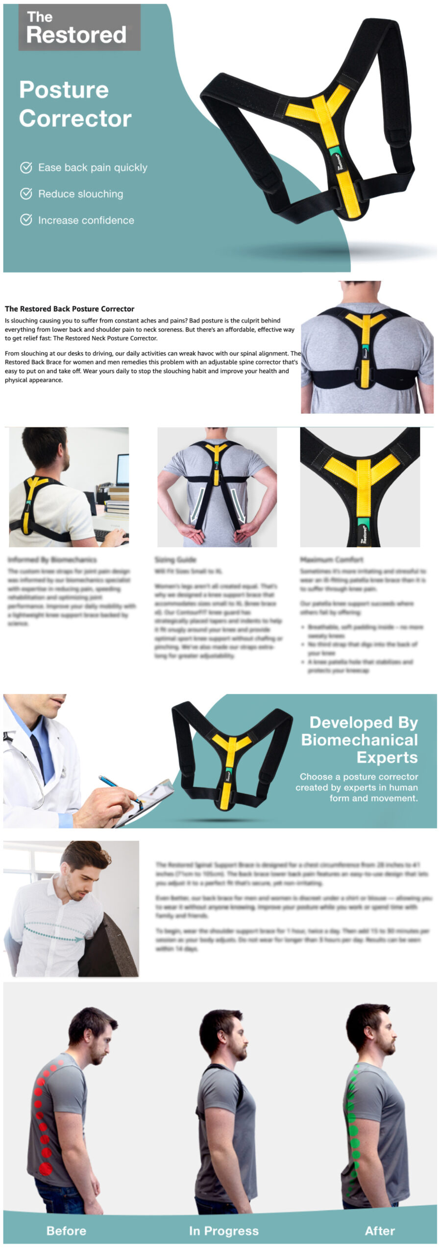


The Restored had a solid product range across health and wellness, from joint supports to sleep aids and supplements, but was losing ground to competitors who were simply showing up better. Despite increasing ad spend, sales had plateaued. The visuals weren’t building trust, the messaging wasn’t reaching the right people, and the budget was working harder than it needed to with diminishing returns.
The Challenge
The Strategic Thinking
Research pointed to one clear truth – the products needed to be seen in real life, not dressed up in heavy graphic design. I made the call to bring in models and shoot the products in authentic, relatable situations, shifting the creative from designed to felt. This wasn’t just an aesthetic decision, it was a strategic one. Real context builds trust faster than polished graphics in a category where customers are making health decisions.
I also made a deliberate choice to simplify the visual language, adopting a calm, restrained colour palette and stripping back on-image text to a minimum. With less clutter competing for attention, the products themselves could take centre stage, and physically appear larger on screen, a subtle but proven driver of click-through and conversion. I applied this thinking across the full storefront redesign, covering all product lines with consistency and purpose.
The Outcome
The results came faster than expected. Organic sales appeared within the first month, ad spend dropped as efficiency improved, and production came in under budget. Within three months of the rebrand, The Restored reached rank 1 in their category on Amazon. Sales increased by 60%, ROI improved significantly, and the brand went from chasing competitors to leading the space.
Store Front
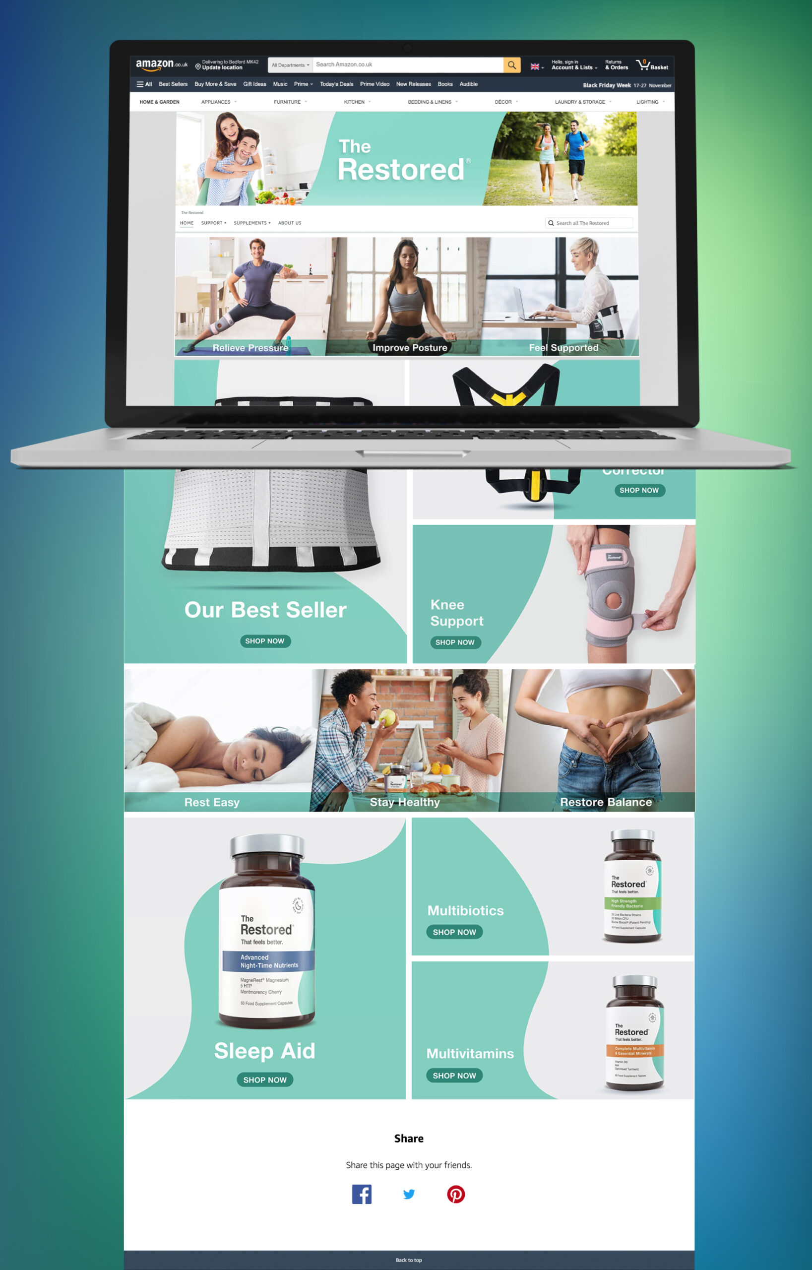
Knee Support
B+ Content
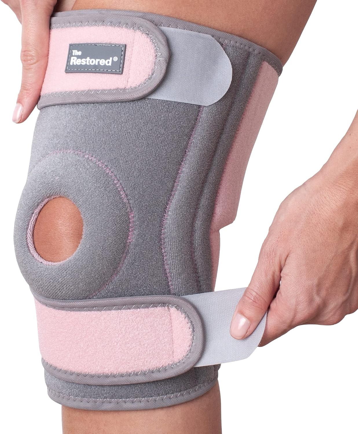
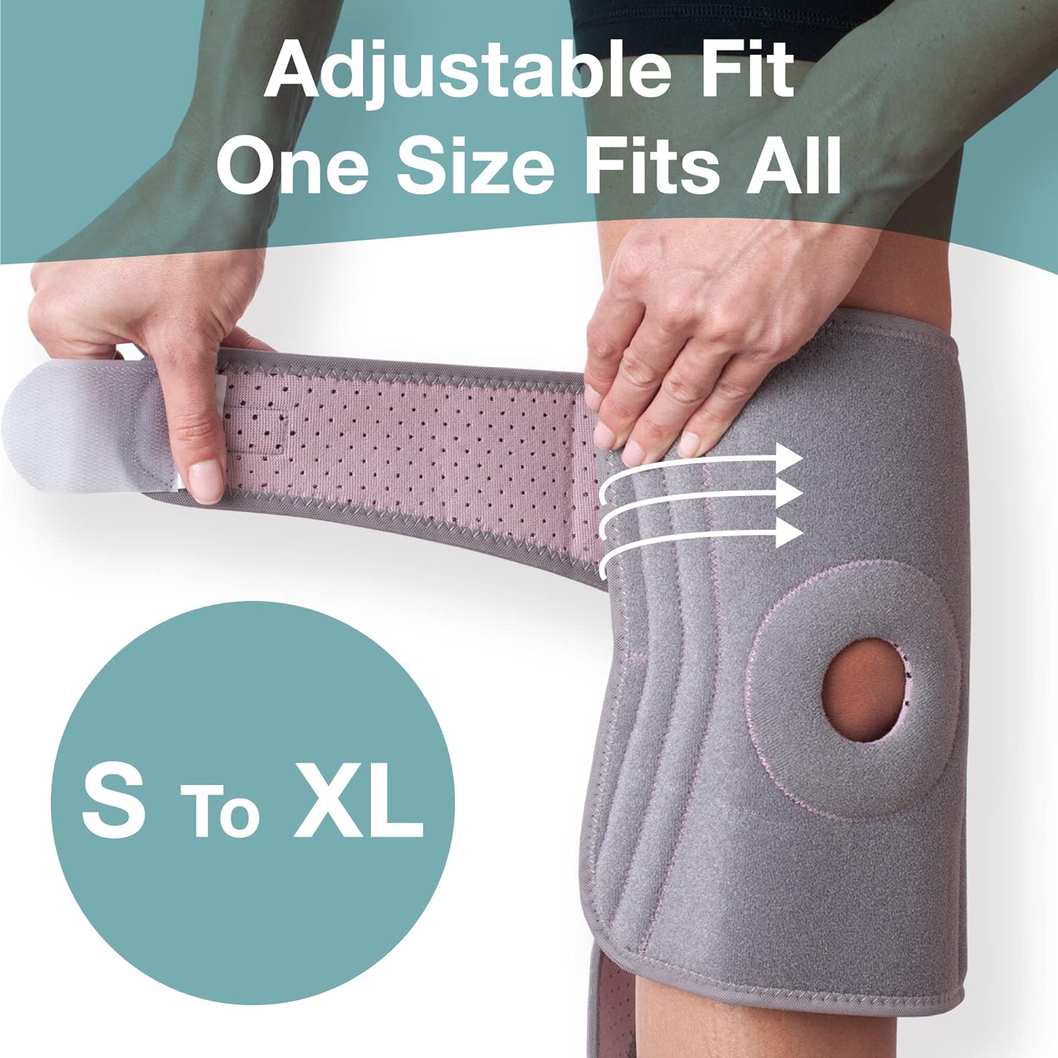
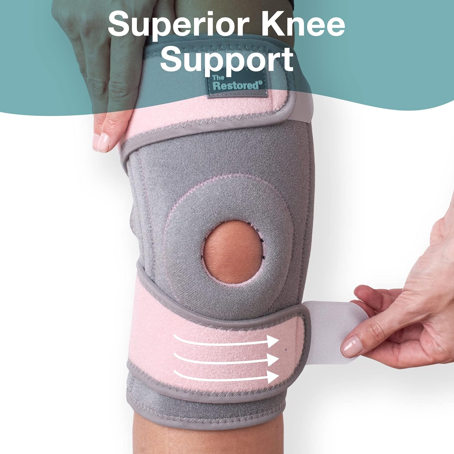
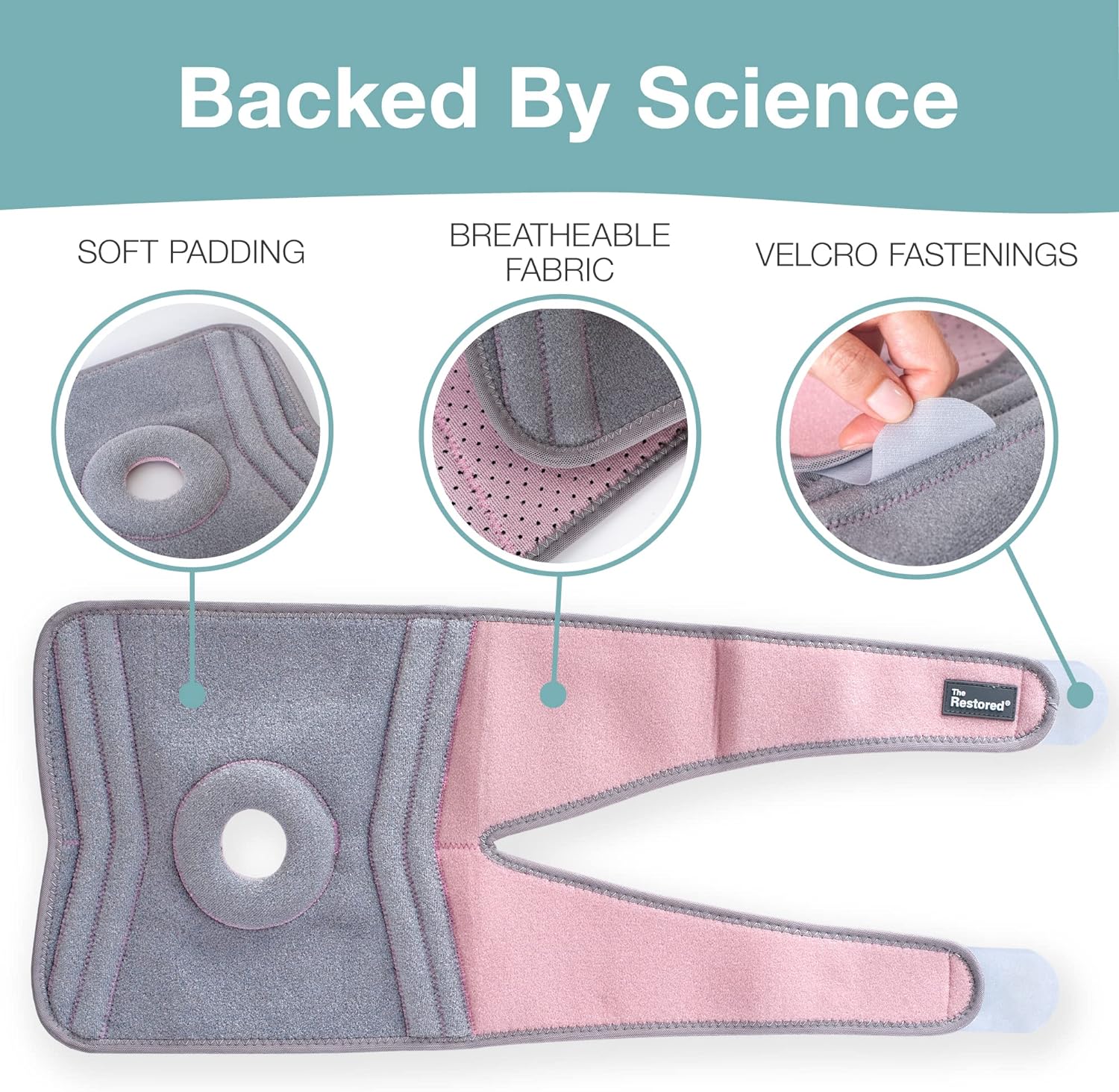
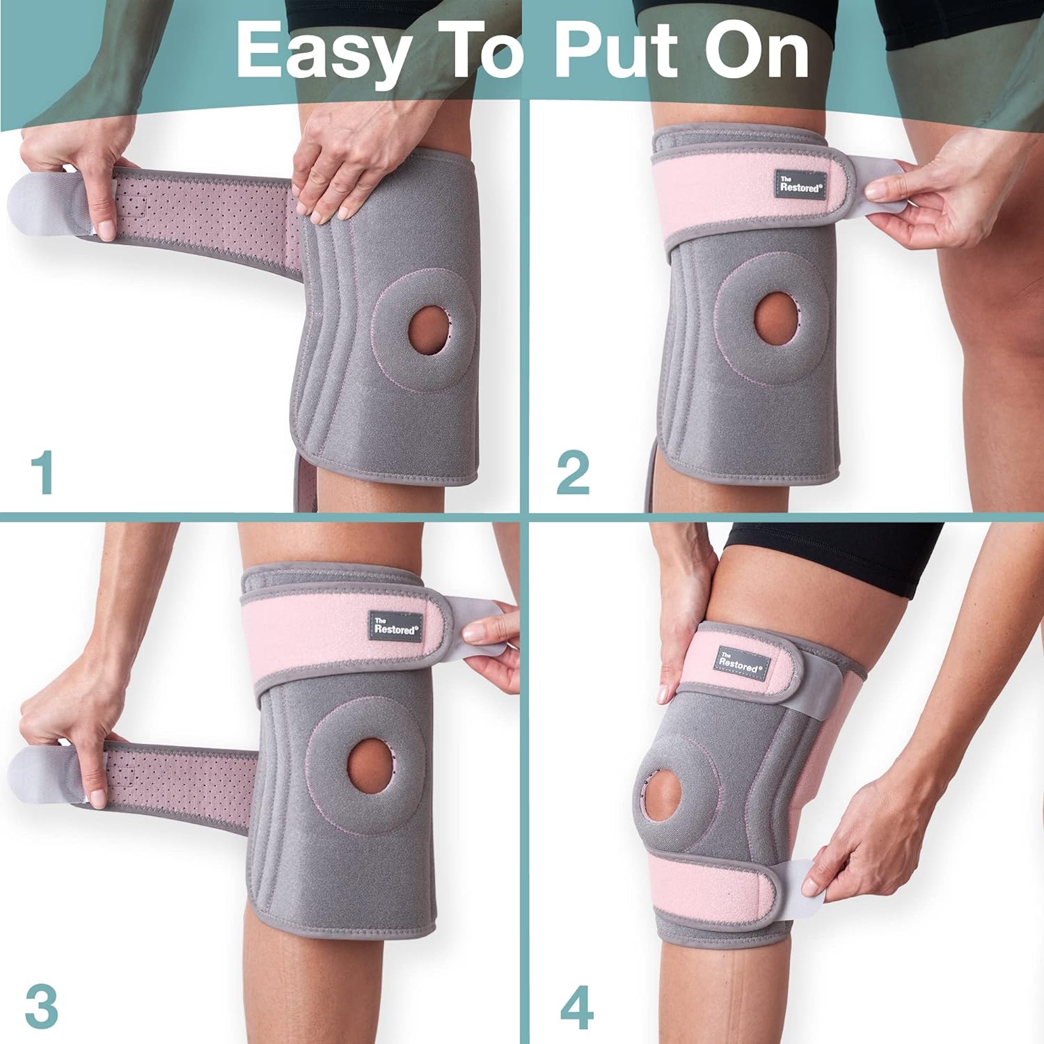

Enhanced Brand Content
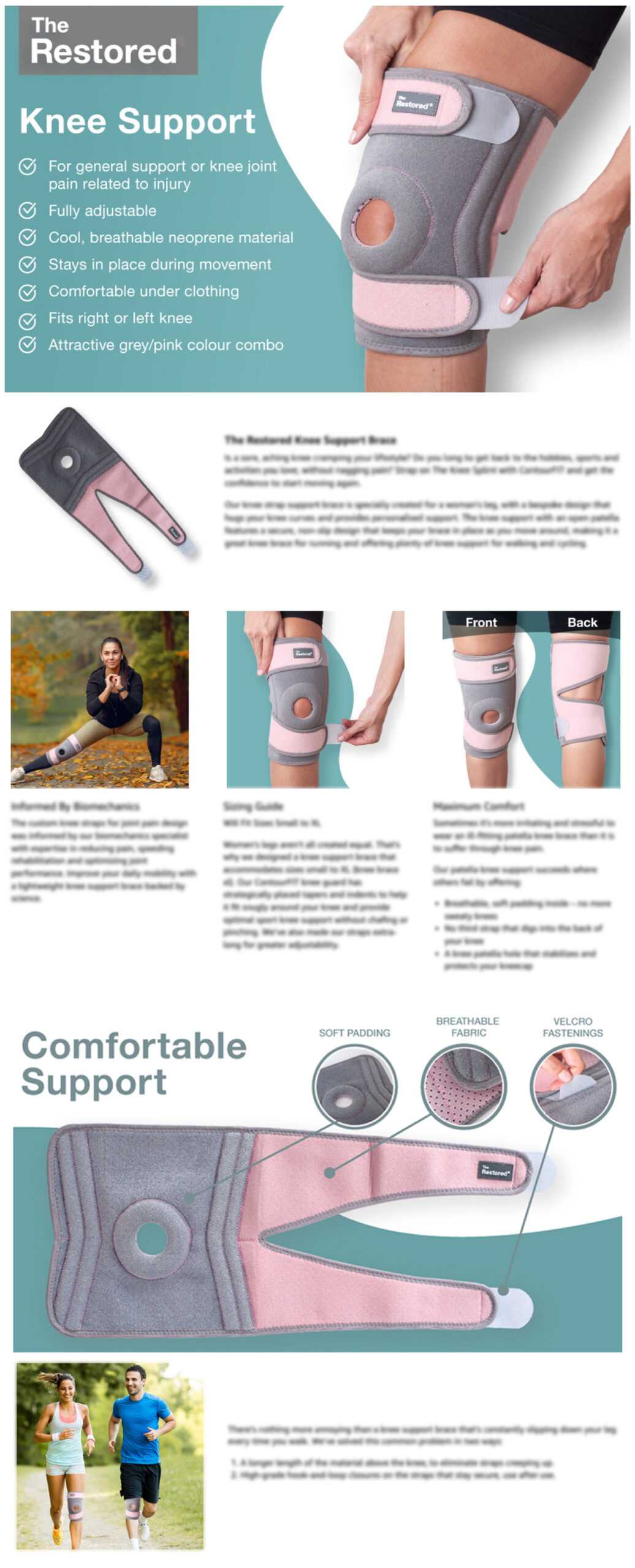
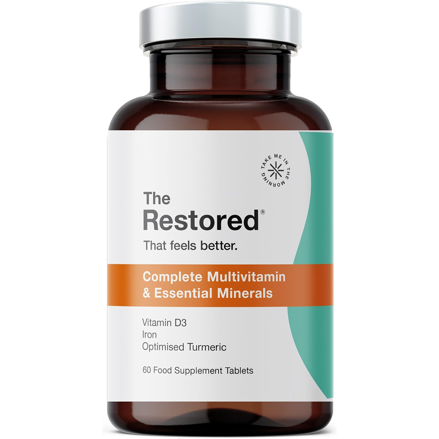
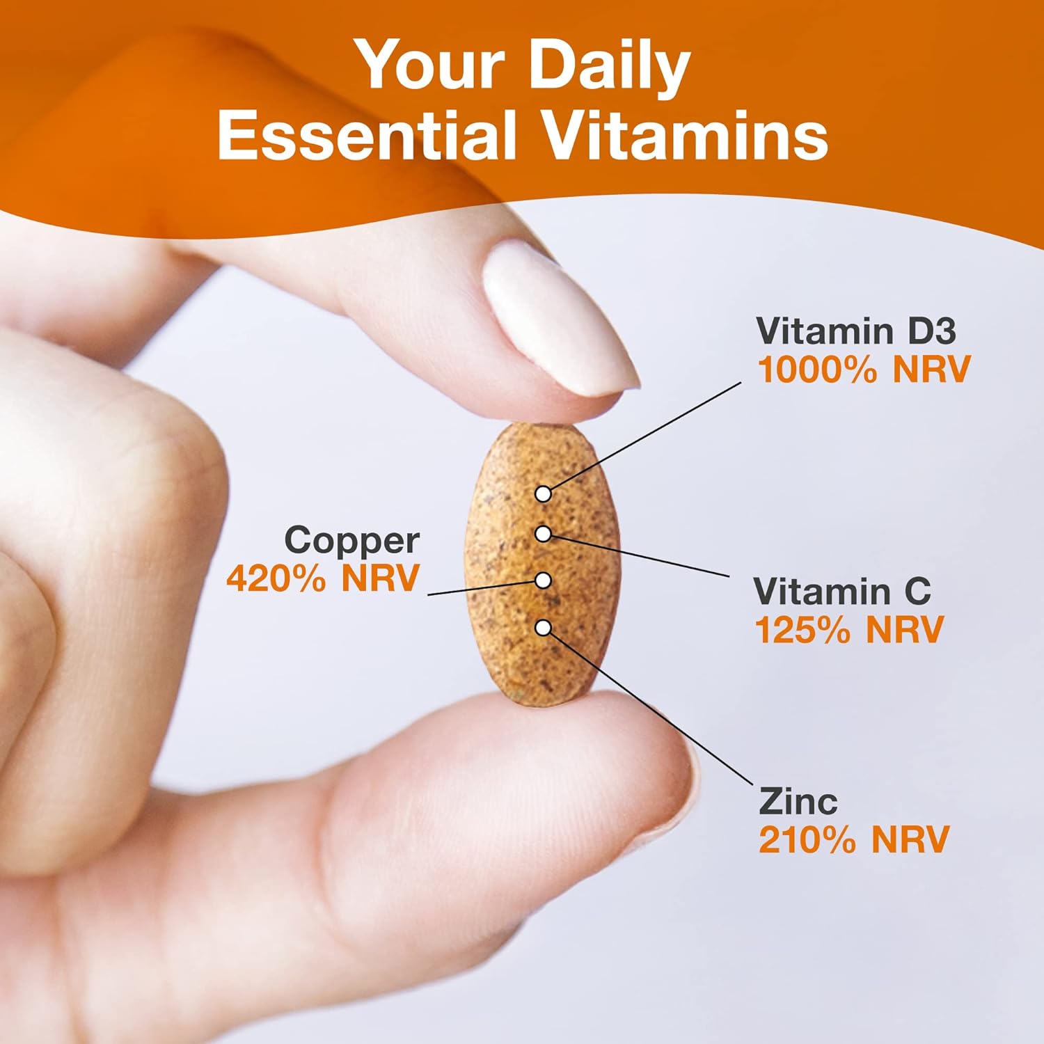
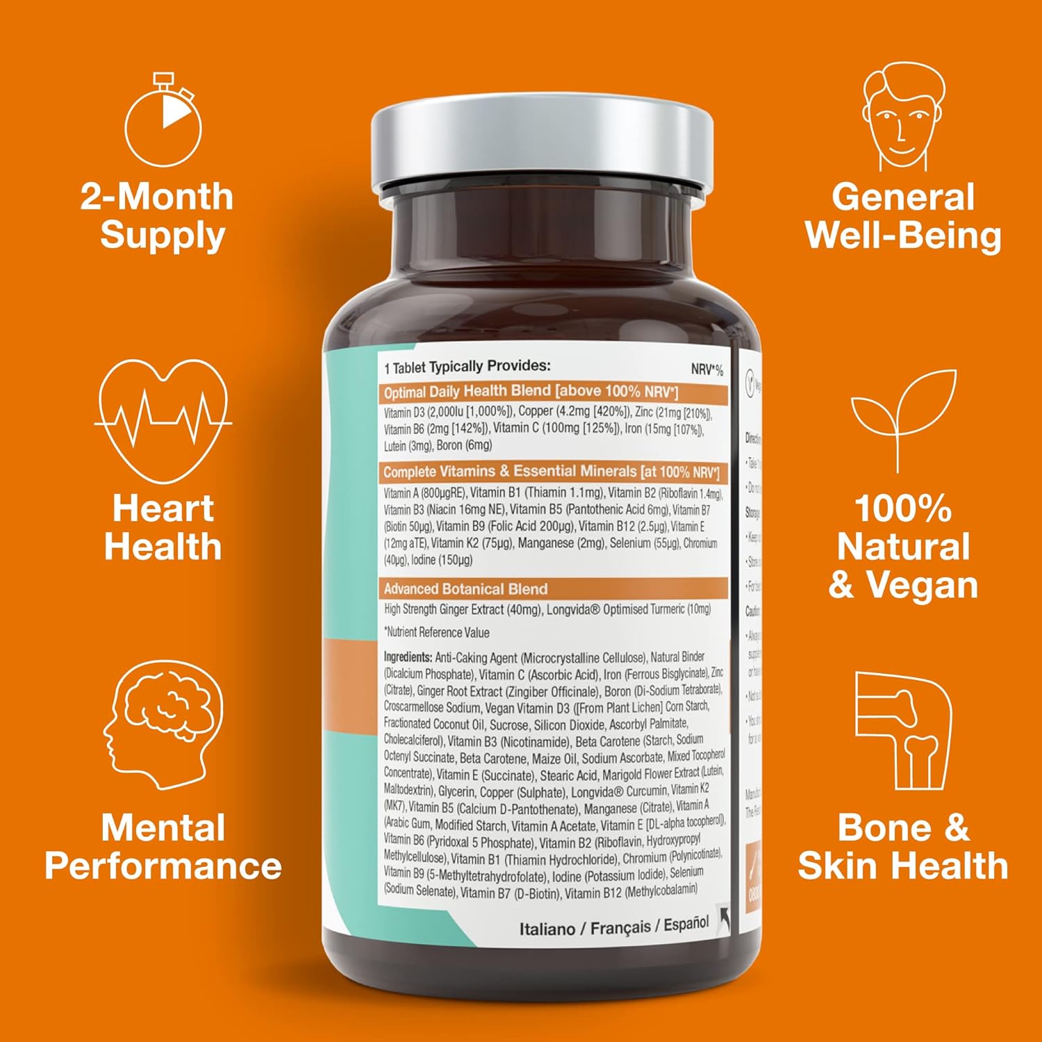
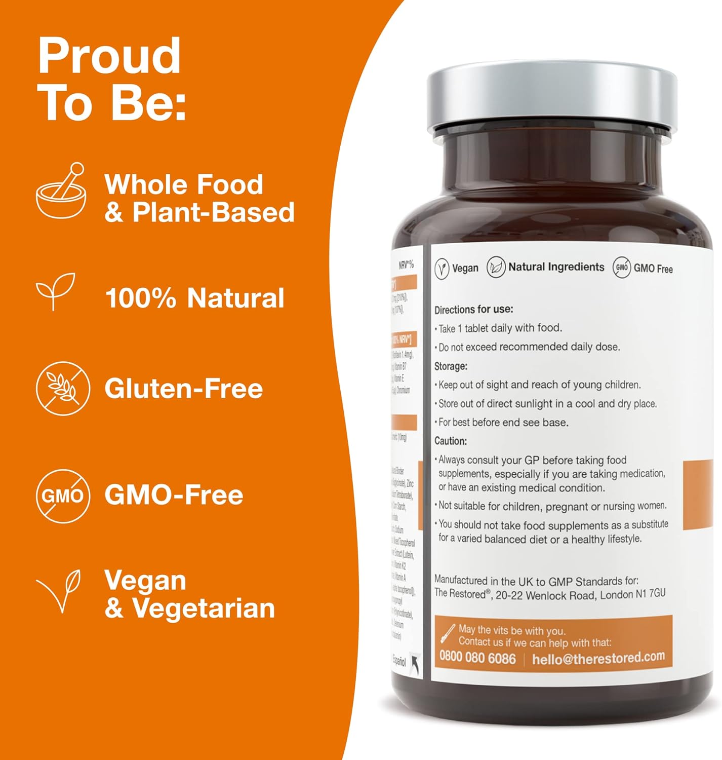
Multivitamins
B+ Content

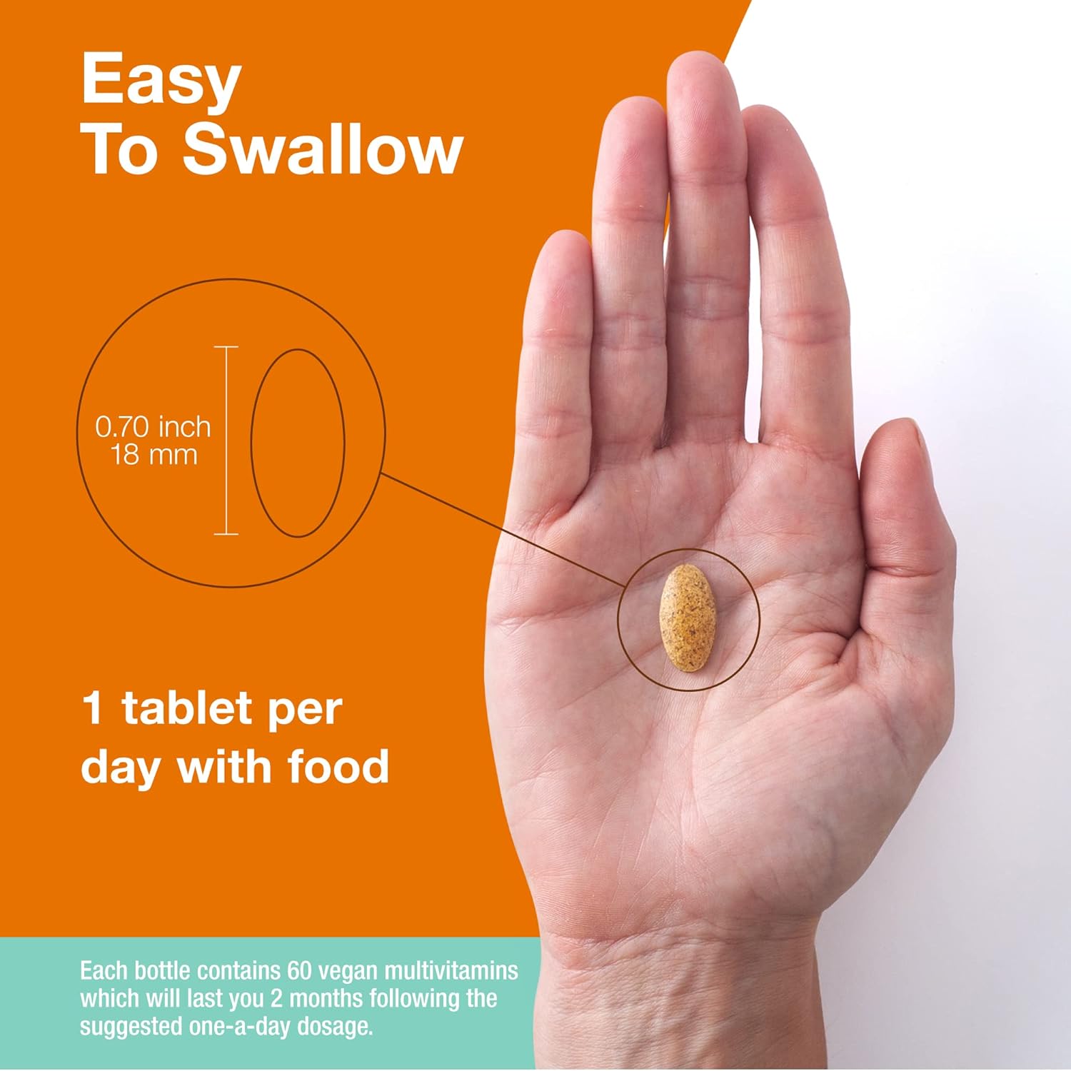
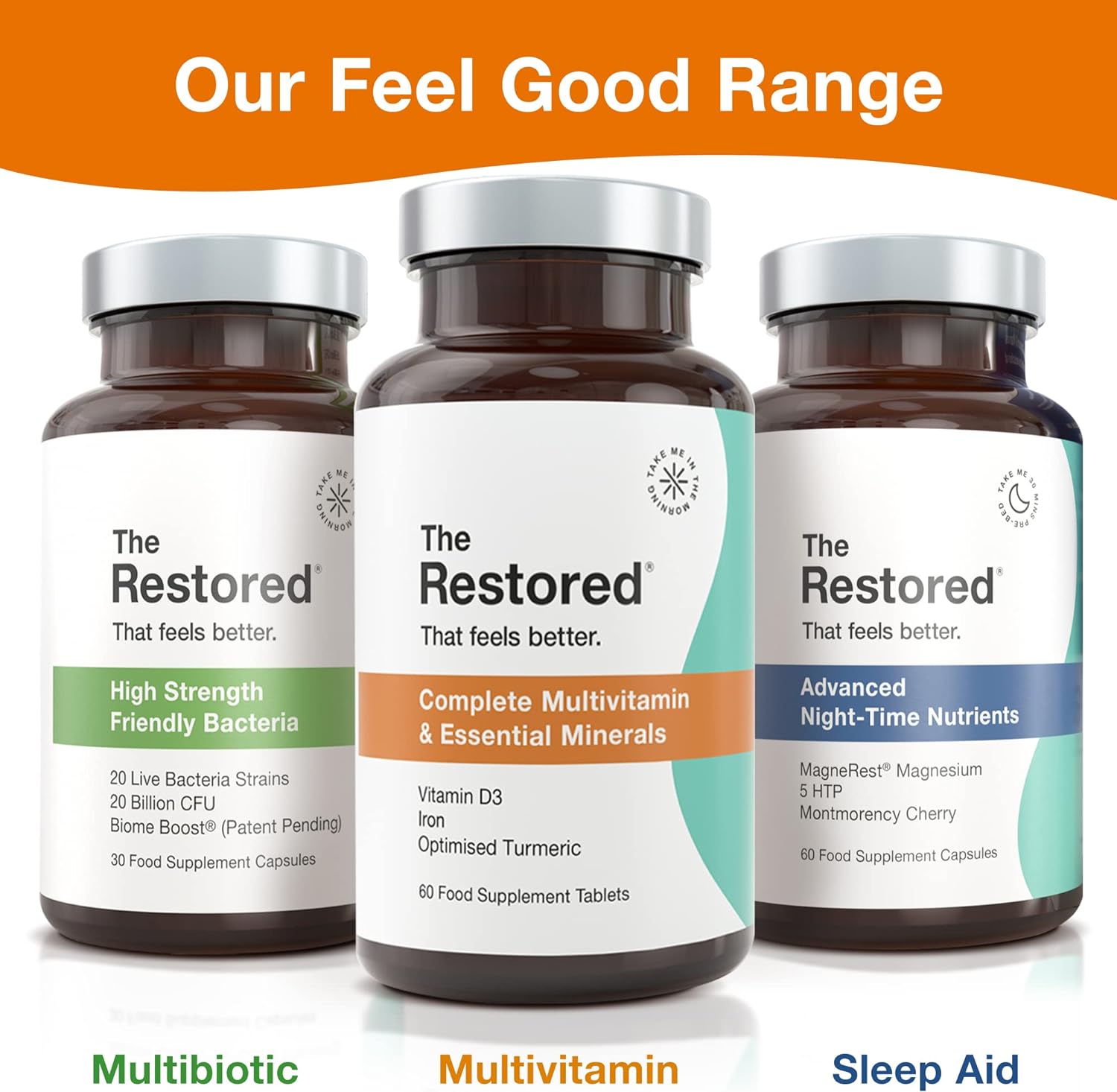
Enhanced Brand Content

Back Support
B+ Content
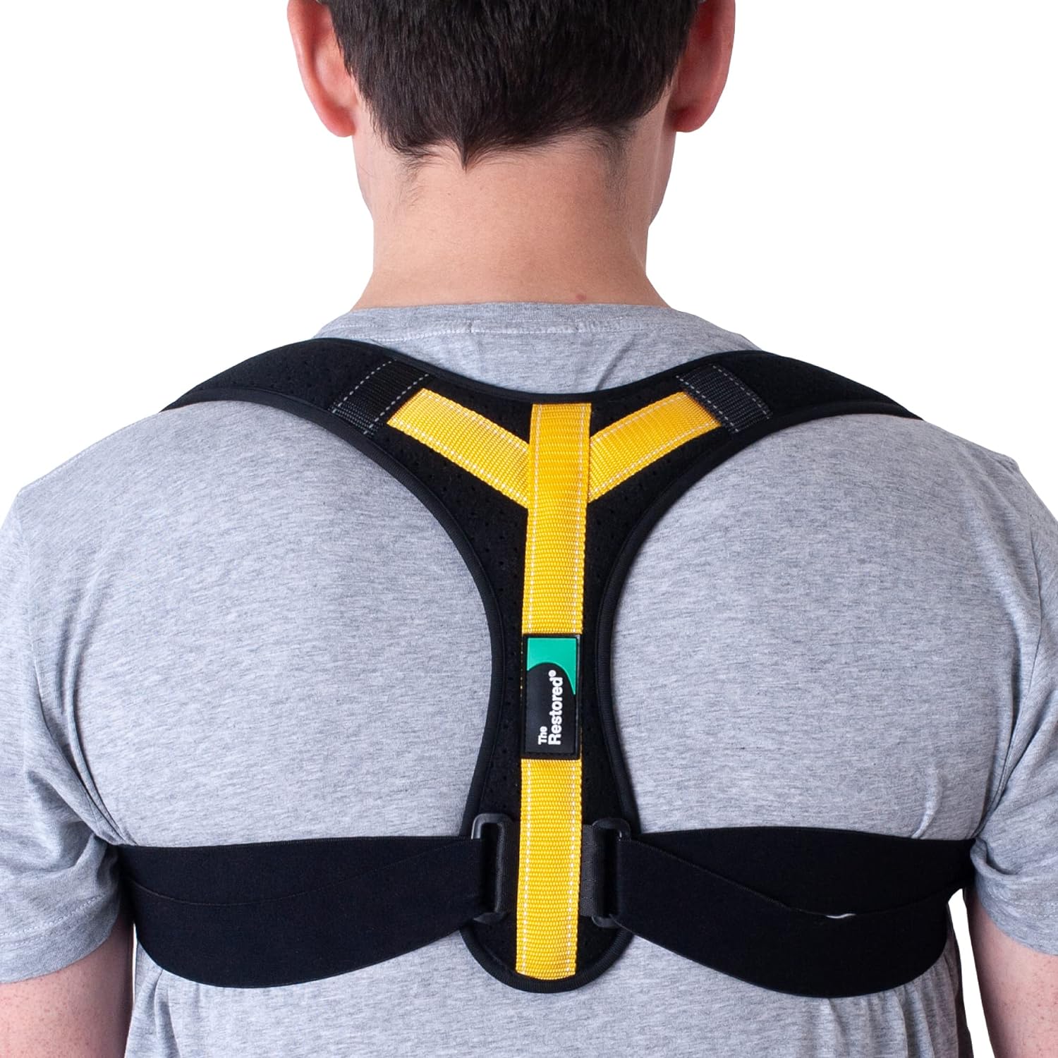
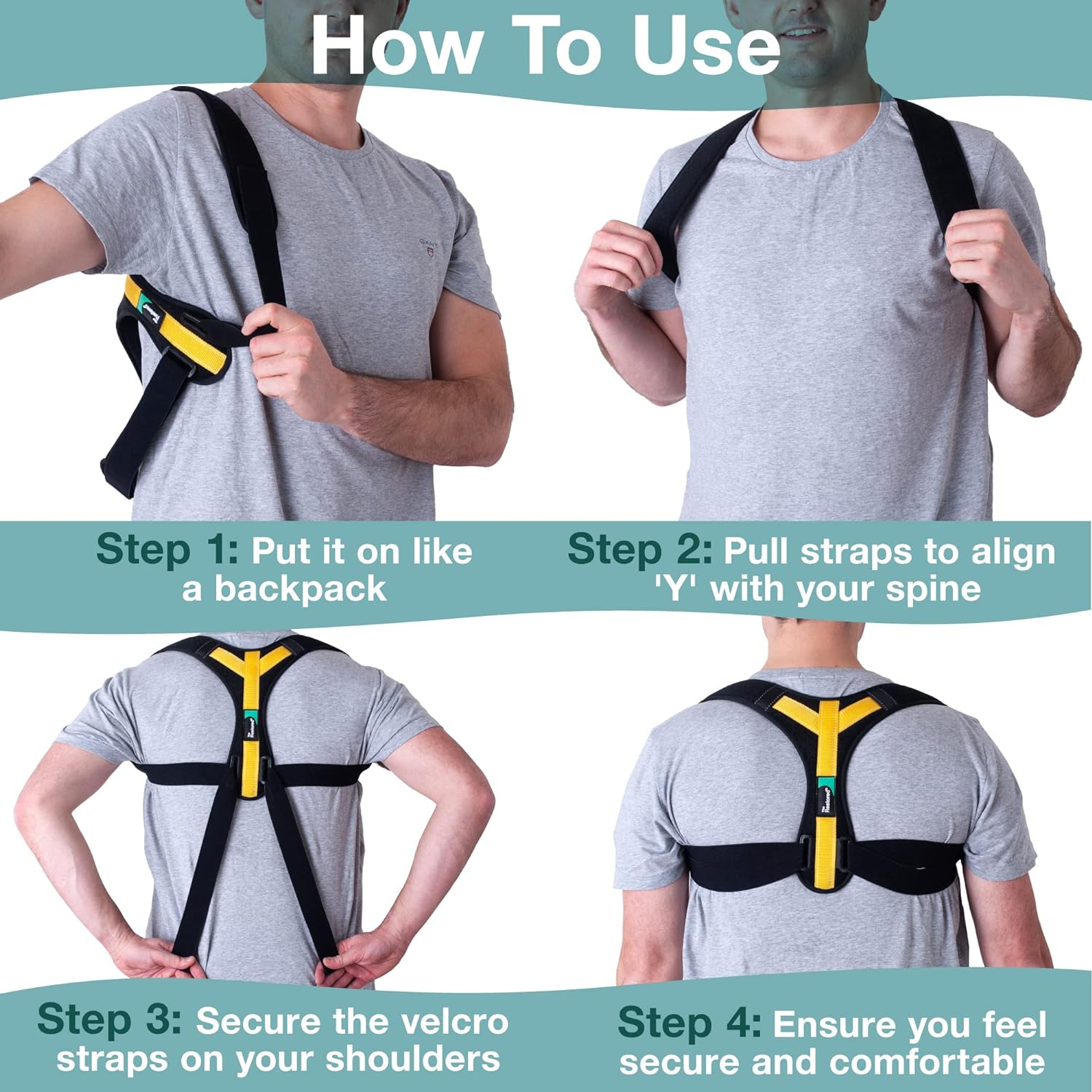
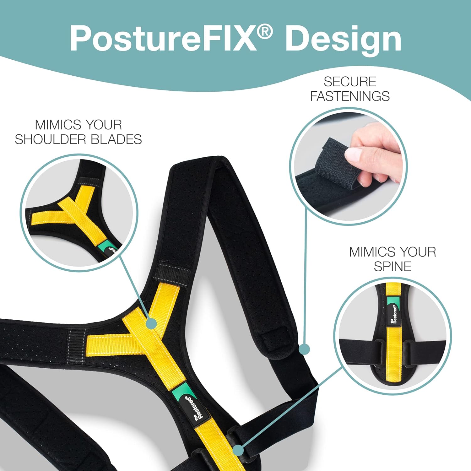

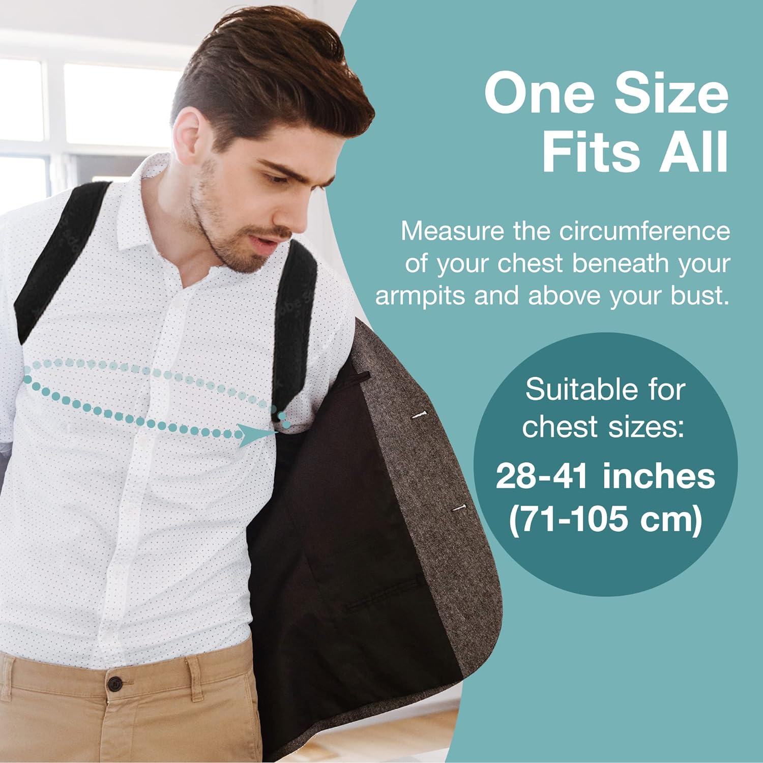
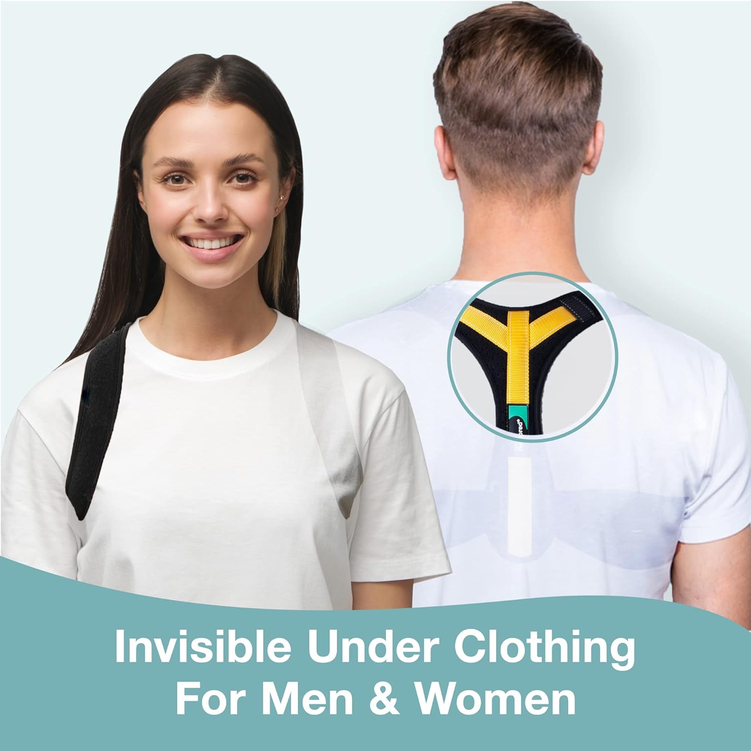

Enhanced Brand Content